Webinar recap: getting the mobile picture
August 28, 2012 Leave a Comment
Last week’s webinar on optimizing mobile commerce was jam packed with strategies and advice for meeting shoppers’ expectations for the upcoming holiday season and beyond. One of the biggest takeaways: the importance of thinking visually for the mobile medium.
As stated in the webinar preview post, most mobile shoppers prefer to view brands’ full-fledged Web sites on their devices, rather than streamlined, text-based versions designed for small screens. That desire speaks volumes about shoppers’ preference for accessing bountiful product imaging as well as browsing alluring merchandising offers.
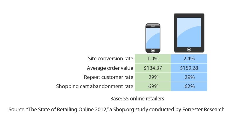
But perhaps more importantly, visually rich mobile sites stand brands in good stead with potentially the most lucrative of mobile audiences: tablet shoppers. The webinar revealed that – a fivefold increase. Moreover, tablet owners form a potentially lucrative market; more than one in three consumers earning more than $75,000 per year owns a tablet, according to the Pew Internet & American Life Project.
Most importantly, the larger screen size makes mobile purchasing a more appealing prospect, as shoppers can more easily navigate products and cart and checkout screens than on a smartphone. As a result, – 3.2% of all web sales, compared with 1.5% for smartphones. And conversion rates are more than twice as high on tablets than on smartphones. Merchants should cater to tablet users’ abilities to use gesture-based interactions, such as taps, swipes and zoom, to view rich visuals.
To incorporate more visuals into their mobile commerce offerings, merchants should not only offer multiple images on the product page; they should also use pictures to convey the brand story throughout the mobile site. Just a few ways to beef up the visuals:
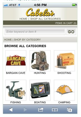
Navigation. Gone are the days when navigating a mobile site meant layers of text-driven menus. Use images or icons in the lineup of product categories to help shoppers scan and locate the relevant section, as Cabela’s does with the start page for browsing products by category.
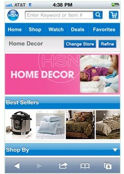
Home and gateway page promotions. Devise a design that includes space for spotlighting products and offers with a primary large image. And maximize screen real estate with “swish merchandising” — swipeable scrolling features such as the “Best Sellers” promotion on HSN’s “Home Décor” gateway page, which elevates a group of bestselling products to prominence.
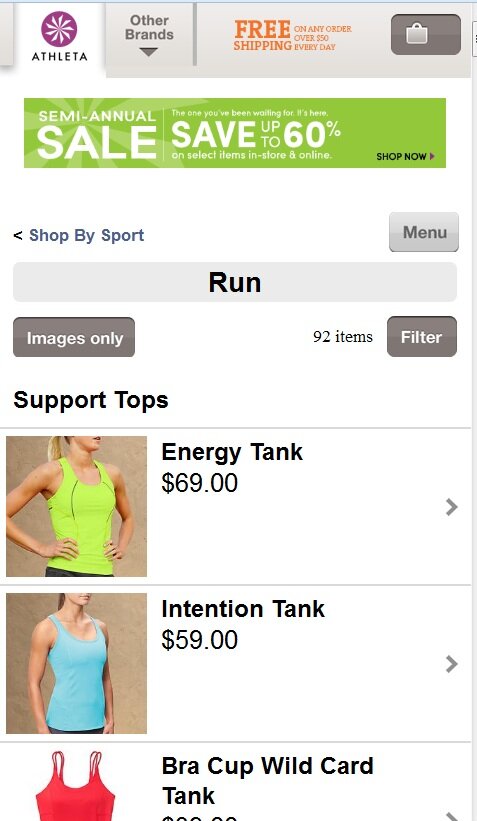
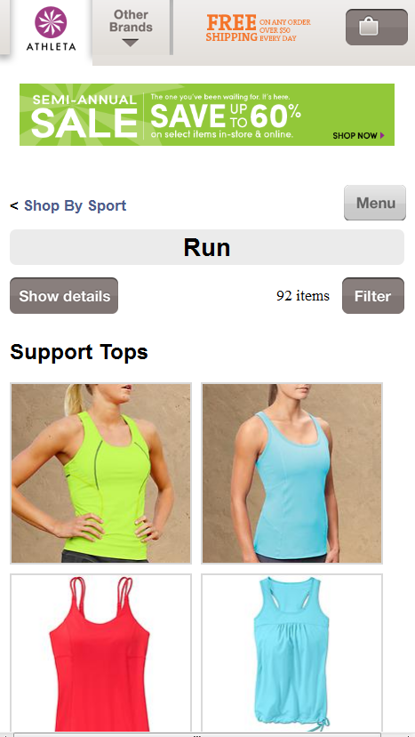
Index pages and search results. Give shoppers the option to view product listings in an image-rich format that puts pictures front and center and fits more items on each screenful. Athleta’s “images only” option eliminates price and product name from listings, allowing shoppers to scroll through items quickly and tap for more information when desired.
Download the webinar replay or the accompanying whitepaper for more strategies and statistics about mobile commerce. What tactics are you using to create a rich mobile experience?
Connect with us: