Should you implement responsive design?
February 22, 2013 Leave a Comment
As merchants strive to serve shoppers on a growing array of devices, the concept of responsive design has definite allure. And with over a quarter of merchants planning a site redesign this year and more than 40% saying mobile and tablet development are a priority, according to industry researcher Forrester, responsive design may become one of 2013’s top buzzwords.
The premise is that a single base of code can serve multiple touchpoints by detecting the device and browser used and changing the layout and functionality on display accordingly — promising merchants a streamlined process for updates and maintenance. But is responsive design really the right choice when it comes to building a seamless brand experience? There are a number of pros and cons to weigh, among them:
Ease of maintenance vs. ease of use. It’s true that responsive design makes site maintenance easier for merchants — but it’s even more important to consider the site experience for shoppers. While sophisticated use of code can resize, rearrange and even add or omit elements on the page, it can be difficult to create a truly device-specific experience that meets or exceeds shoppers’ expectations. For example, the footer on the desktop browser version of the responsive site for Perry Ellis brand Original Penguin includes an 800 number and a badge indicating shoppers can pay with Paypal, both of which are dropped from the mobile version of the same page. But arguably, the phone number — with click-to-call functionality built in — is more important than ever on the mobile site, where merchants should use every means at their disposal to build trust and ease communication with consumers wary of making purchases on their phones. Similarly, the Paypal badge should be even more prominent than on the desktop site, given that more than two-thirds of transactions on mobile phones are completed using alternative payments rather than entering credit card data.

Desktop footer

Mobile footer
It’s important, too, to consider the content of shared elements and whether they truly scale to fit different formats. U.K. electronics giant Curry’s uses responsive design to deliver different sites to mobile and desktop browser users. The main rotating promotions on the home page, however, don’t exactly fit the designated space when viewed on the mobile browser — and some of the images containing multiple products are just too tiny to be effective.

Desktop home page promo
SEO boost vs. performance drag. Another potential benefit to responsive design is that all inbound links from any device or browser point to a single URL — giving that flagship site maximum potential relevance when being ranked for natural search engine results. It’s a worthwhile consideration, since the number of inbound links originating from mobile is significant; for example, — and potentially share product links, “likes” and reviews there.
At the same time, the complexity of the code required to build a truly responsive site can add to page weight, affecting site performance and frustrating the potential customers who clicked on that page-one search results link. As of 2010, , penalizing slower sites as potentially less credible — thereby potentially canceling out some of the positive SEO impact of having a single URL. And on mobile devices, the expectation for speed is more acute than ever; performance monitoring firm Gomez found that 59% of mobile users expect sites to load in 3 seconds or less, while 46% of mobile users would be unlikely to return to a site that had experienced load time problems.
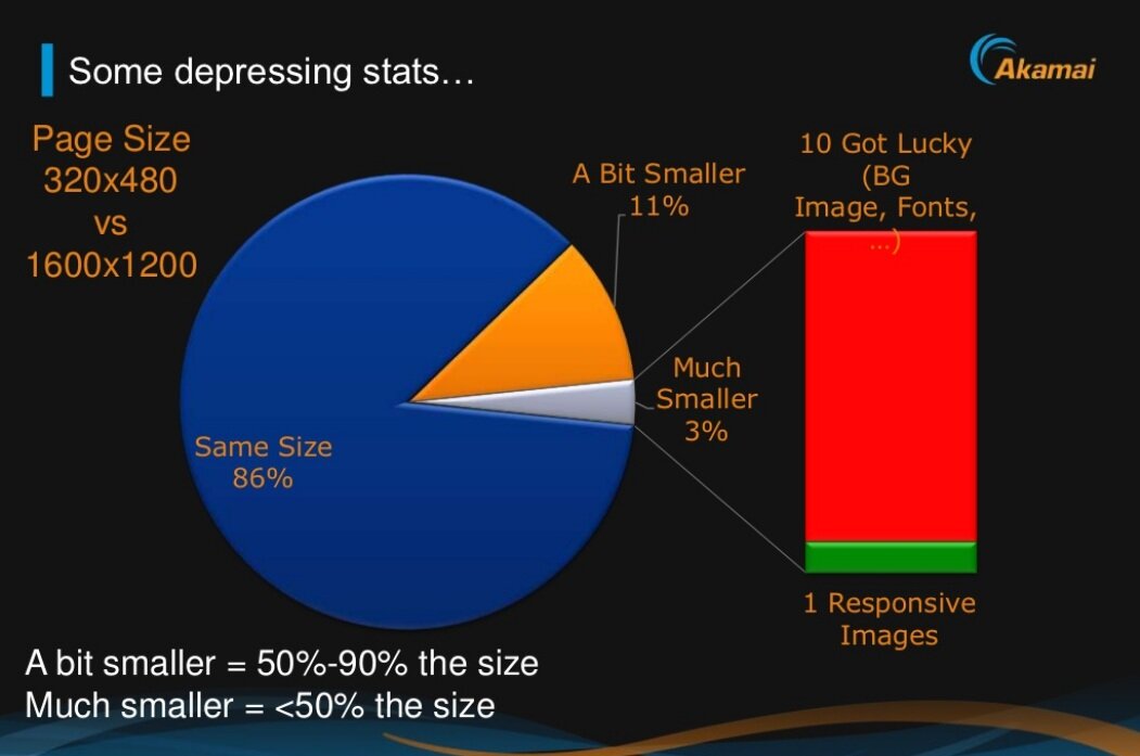
Of course, using separate sites for different devices can cause problems of its own — namely, the loss of speed associated with redirecting shoppers to the right URL. And as with usability and functionality problems, there are ways to avoid performance problems associated with responsive design, such as starting with the mobile version and adding enhancements for tablets and desktops, rather than trying to go from large to small. But the majority of responsive design sites currently don’t employ these techniques, according to performance firm Akamai, which found that 86% of responsive sites’ mobile pages were at least 90% as big as the desktop browser versions.
The upshot? Merchants undertaking a redesign should consider using responsive design, as it has great potential. But they should weigh the costs of doing it right versus the costs of maintaining separate sites for different devices — and recognize that responsive design isn’t a cheap silver bullet for solving all their multi-touchpoint needs.


Connect with us: