Why to adopt a “mobile first” strategy for email
March 6, 2013 Leave a Comment
Most merchants are aware that mobile commerce is a top priority for their businesses. But with more and more research indicating a massive shift is underway in how shoppers connect with brands, merchants need to go beyond merely developing a set of mobile-friendly templates for the eCommerce site and embrace a mobile-first philosophy for every aspect of their online strategy. The shift is especially important when it comes to the tried-and-true channel of email marketing, which has been an outstanding performer for merchants over the years — and which merchants must optimize in order to maintain the ROI they currently enjoy.
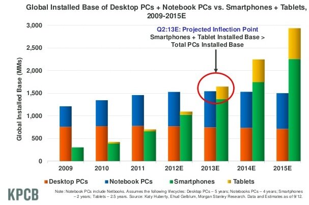
By some estimates, mobile is poised to take over as the default Internet touchpoint as early as this year. According to data from venture firm KPCB, the global installed base of smartphones and tablets is estimated to edge above desktop and notebook computers this year, and then widen the gap in 2014 and 2015. In the U.S., 29% of consumers own a tablet or e-reader, up from less than 20% last year, according to KPCB, while 48% of cell phone users have a smartphone — a jump of 50% from a year ago.

This year is also when the majority of marketing email opens are predicted to occur on mobile devices, according to marketing firm Knotice. Already, 77% of smartphone owners use their devices to read email once a month or more, according to industry researcher Forrester.
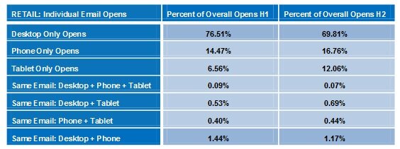
And lest merchants think that consumers merely scan Subject: lines on mobile devices, deleting the chaff and saving emails of interest to read later on desktop PCs, Knotice’s data reveals that subscribers only interact with messages once — regardless of device — with fewer than 3% viewing email content on multiple screens.

With the percentage of desktop computer interactions dropping in the course of 2012 and the percentage of mobile and tablet opens rising — in the case of tablets, by more than 80% — it’s high time for merchants to think “mobile first” when it comes to email campaigns. It’s crucial to deliver different versions of campaigns depending on a shopper’s browser and device type. Mobile versions should:
- Have shorter Subject: lines. Mobile email clients truncate long Subject: lines, so aim for 30 characters or fewer, compared with 50 characters for emails opened in desktop browsers or email clients.
- Accommodate “fat fingers.” Nothing is more frustrating when using mobile devices than aiming for one link and hitting the adjacent one by mistake. Mobile email design should incorporate more white space than the desktop version – around 45 pixels – so that smartphone users can select desired links with ease.
- Present a streamlined view. Cut the navigation clutter and spotlight a few select products to avoid forcing mobile recipients to scroll endlessly through a barrage of information. Not only will the content be more digestible, but a streamlined version will load more quickly – an essential consideration.
- Include device-targeted content. Message specifically to mobile users with content that connects them to physical store locations, enabling cross-channel shopping. Additionally, put the spotlight on social sharing, since from their devices, according to Google.
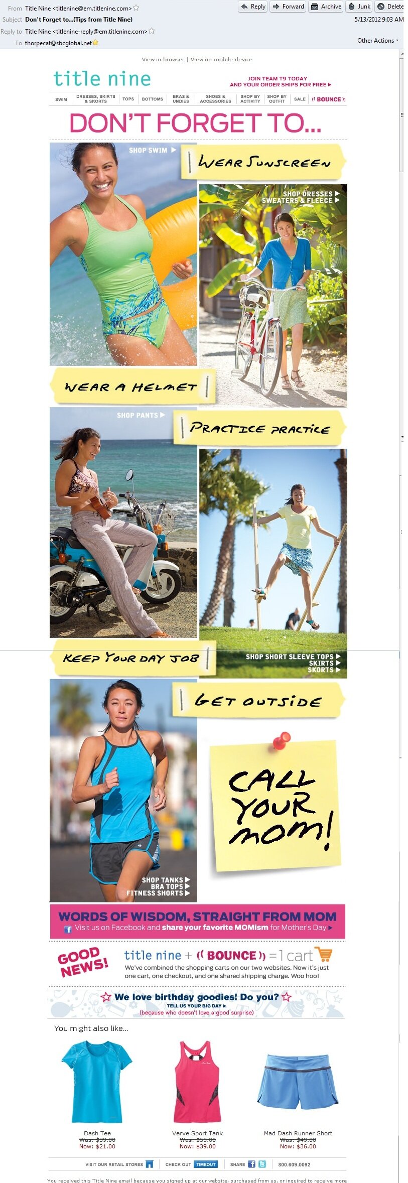
Recreational apparel merchant Title Nine puts it all together, serving a streamlined version of its Mothers’ Day promotion for mobile phones. The mobile version uses the same theme and look and feel of the full-fledged message for viewing on desktop email clients, but features links to products from just one of the featured ensembles. The mobile version also elevates links for social sharing on Facebook and Twitter, and prominently invites viewers to share their “favorite MOMism” on Facebook.


How have you adapted your email strategy to incorporate mobile?
Connect with us: