A different view of thinking visually
April 16, 2013 Leave a Comment
We’re still processing all the ideas exchanged during last week’s MarketLive Summit, our annual gathering of MarketLive merchants, technology partners, and guest experts. There was valuable information presented at every turn, from inspiring keynote speeches to nuts-and-bolts breakout sessions and training seminars.
One thread from the opening day’s keynotes resonated with our recent post on thinking visually — or rather, jarred loose a few assumptions. Tim Ash of Site Tuners gave a bracing keynote titled “Why Your Online Catalog Sucks (And What to Do About It)” which revealed how shoppers actually use web sites, as opposed to how merchants design them. He urged merchants to validate new site concepts with user testing, rather than just internal vetting, and to jettison ideas that didn’t contribute directly to boosting conversion.
Ash demonstrated how the power of imagery can either significantly enhance a site — or overpower shoppers with the wrong message. The takeaway? Merchants experimenting with new modes of visual selling must balance aesthetics with utility — starting with these tips:
Motion requires cohesion. Humans are hardwired to pay attention to motion, Ash noted: we have 220 degrees of motion perception, as opposed to just two degrees of detailed visual acuity. For merchants, that means elements involving motion are bound to dominate viewers’ attention to the exclusion of the rest of the page; home page slide shows promoting a variety of offers and products can contribute to a sense of chaos, as well as rendering the rest of the page nearly invisible.
While scrolling elements are unlikely to disappear from the landscape any time soon, merchants must be judicious in their use. Throwing a grab-bag of promotions into a slide show is no substitute for editing; scrolling displays should have a through-line of theme, tone and message and should support the brand’s overall identity. Pottery Barn ties together its home page slide show with the tagline “Colors of Summer,” showcasing a variety of housewares for the upcoming warm-weather season.
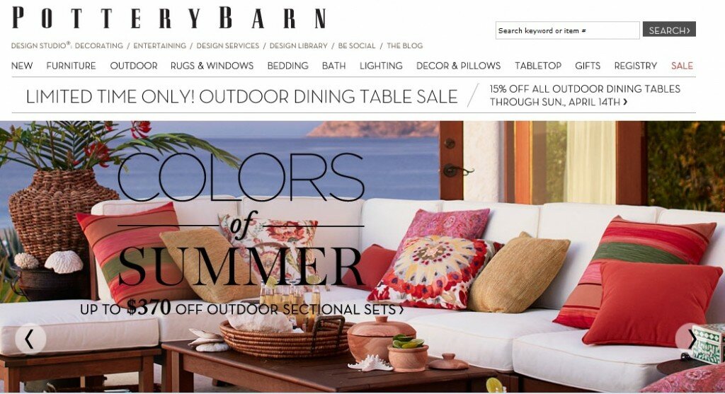
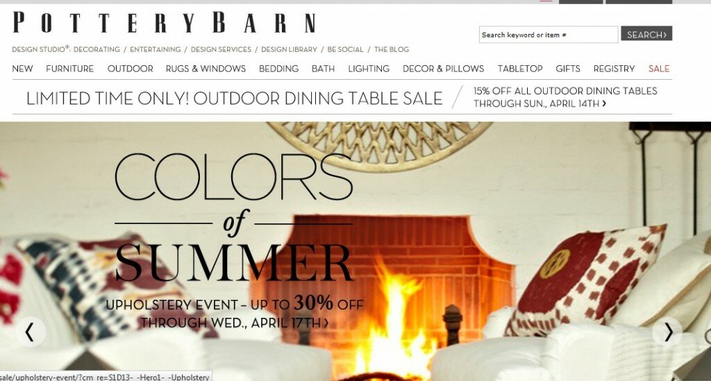
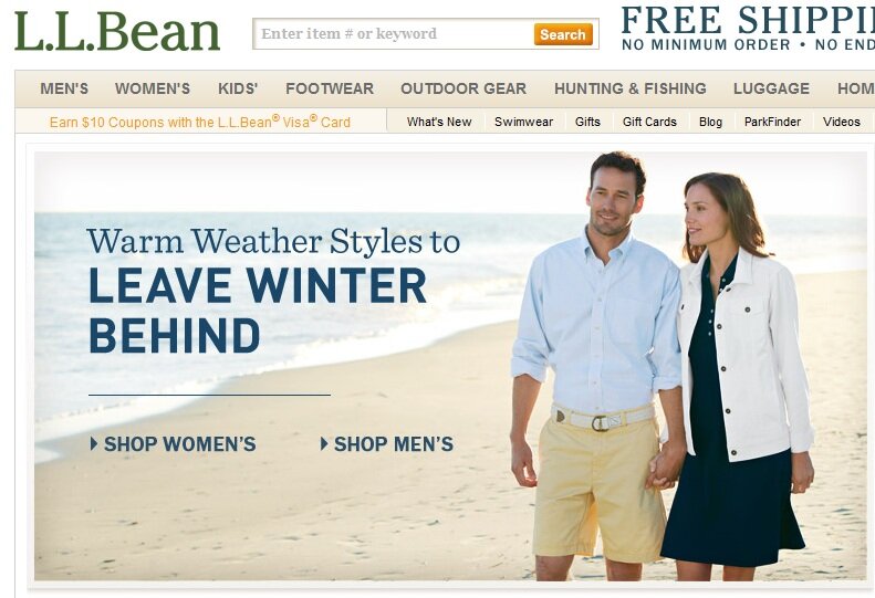
Choose heroes wisely. While too many images can overwhelm viewers, too few can be limiting. Ash displayed several sites whose single main home page image did little to convey the breadth and depth of the product offering — whether because a graphic touted a sale (without showing what products were discounted) or because a photo showed just one ensemble or item from a single category on the site, potentially leading viewers to believe only women’s apparel was available, for example. Merchants should divide home page real estate to display multiple images for several major categories, use personalization to serve the most relevant array of images for returning visitors, or choose a “hero shot” that demonstrates the array of products on offer, as L.L. Bean’s featured image does by showing both a male and female model.
Use images as organizers. Because images can convey so much more information quickly than text, Ash advocated using them to help browsers quickly comprehend category organization. The key is to create custom, composite images that accurately reflect the array of products within a category, rather than selecting a single item to represent the whole, which can mislead shoppers into thinking the selection is limited to what’s literally on display. B&H Photo’s home page offers shoppers a visual guide to the site, displaying images for each major category that instantly convey the array of goods on offer — such as the tripod and camera with boom mic and eyepiece for “Professional Video.”

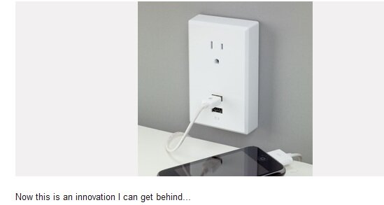
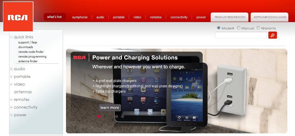
Use social images with staying power. Ash didn’t touch on social media during his presentation, but a snippet from fellow keynote speaker Sucharita Mulpuru dovetailed with his usability-centric theme. According to Mulpuru, who’s principal eCommerce analyst at technology researcher Forrester, fully 70% of links on the visual social network Pinterest are dead ends, presumably in some cases because the featured products or offers are no longer available. And the phenomenon surely isn’t limited to Pinterest; with merchants now able to embed product links into photos shared on a variety of social media, and with consumers now able to redistribute those images freely, merchants must have a strategy re-routing defunct product links to relevant category or index pages. At the very least merchants should offer an “item not found” page that displays relevant alternatives based on the original product. Pinterest users clicking on a year-old link to an individual RCA product that’s presumably no longer available are routed to the home page, where the main display features links to related items in the power and chargers category.
How are you balancing aesthetics and usability when creating image-rich features?
Connect with us: