Getting real with the trends – MarketLive Summit report

Setting priorities is always a top challenge for merchants, what with the whirlwind pace of change in the world of online commerce combined with the need to abide by limited budgets. Thankfully, attendees of last week’s MarketLive Summit received significant help with focusing their to-do lists, thanks to industry expert Sucharita Mulpuru, principal eCommerce analyst at technology researcher Forrester.

In her keynote presentation, Mulpuru dissected six big trends that have been generating plenty of hype and presented merchants with real-world options — and, in some cases, alternatives — for acting on them. Among her top revelations:

Multi-channel fulfillment: Walk before running. While major merchants are promoting same-day delivery in some regions, Mulpuru noted that even they can’t offer coast-to-coast coverage — and that consumers overwhelmingly opt for “free” over “fast” when it comes to shipping. For that reason, she advised that most merchants should focus on other priorities when it comes to multi-channel fulfillment, including:

  • “Endless aisle” opportunities for in-store sales. Associates should be trained to help shoppers find and buy items online that are out of stock on store shelves. Self-service kiosks and tablet devices for store associates can help bridge the online/offline divide.

  • Order online, ship from stores. Mulpuru noted that merchants offering the ability to shop online and pick up items in stores have a steep hurdle to surmount, as inventory must be available in the location a shopper selects; by contrast, enabling local stores to fulfill online orders speeds delivery and gives merchants the option of tapping inventory from multiple nearby outlets to get the job done.

  • E-receipts. Delivering physical store receipts via email gives merchants the opportunity to tie together online and offline shopper activity via the shoppers’ email address. For that reason, it’s a top priority for multi-channel brands, Mulpuru said, with more than 40% of merchants in a recent survey saying they’ve implemented it or plan to do so within two years. Macy’s invites shoppers opting for an e-receipt to sign up for email updates at the same time, then follows up with a welcome email tailored to the physical location, including a discount with an in-store redemption option.
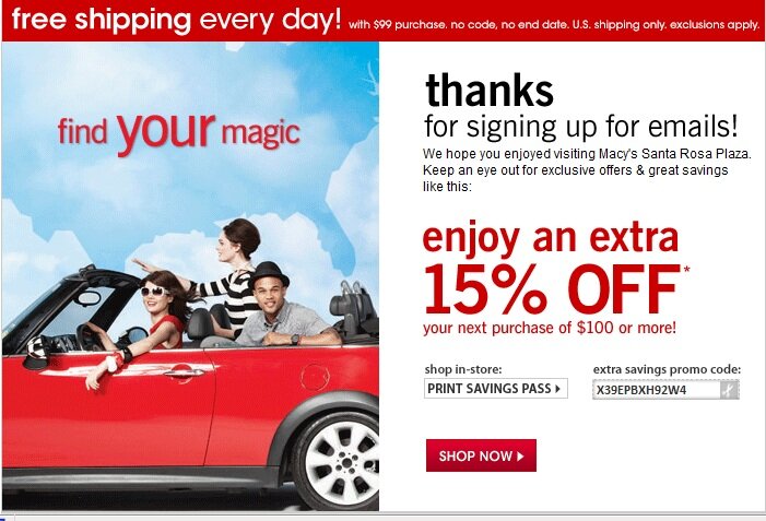
E-receipt example from macy's

Basic mobile competence is enough — for now. Mulpuru shared deep-dive analytics on mobile shopping behavior showing that while traffic from smartphones and tablets is growing exponentially, most interactions are shallow and brief. For example, while 10.7% of eCommerce site visits originate on smartphones, just 7.6% of pageviews do — and average conversion is a dismal 0.5%. And she shared dramatic results from two merchants demonstrating that a large investment in mobile doesn’t necessarily translate into higher conversion: both sites garnered 1.5% of online sales from mobile phones, despite vastly different budgets for mobile technology.
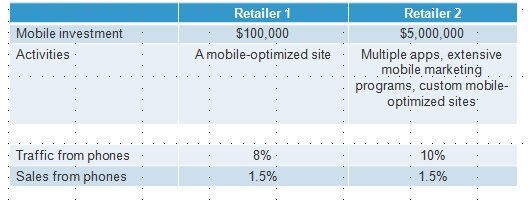
Mobile data from Forrester

While it’s possible to interpret this data to suggest that mobile as a whole is overblown as a priority, the fact remains that shoppers do expect to engage with brands via their tablets and phones — so merchants must develop mobile-friendly outposts to meet that demand. And the positive spin on Mulpuru’s data is that even merchants with modest mobile budgets can compete for mobile spending dollars, if they cover the crucial basics we’ve often describeda mobile-friendly shopping experience that incorporates long-standing eCommerce best practices and an easy mobile payment process chief among them.

Brand uniqueness counts more than ever. Using the phenomenon of dynamic pricing as a starting point, Mulpuru led Summit attendees through a fascinating discussion of how the legal underpinnings of commerce have shifted in favor of manufacturers, giving them increasing power to determine how and at what cost their goods are sold — a trend that may well give Amazon and other mega-merchants pause in their race to sell products at the lowest price point. Mulpuru urged merchants to stop obsessing about dynamic pricing and put the focus on products and brands that couldn’t be commoditized — that is, the unique offering that makes their brand a fit for their target audience. Among the practical applications of this recommendation:

  • Brand manufacturers should be the go-to resource for information about their products. Brand manufacturers can compete online for direct-to-consumer sales — and have a distinct advantage in that they are the original experts about their products. Manufacturer sites should reflect that advantage by giving shoppers encyclopedic product information in a variety of formats. Bedding manufacturer Cuddledown provides numerous buying guides, videos and other shopping tools, including a step-by-step guide to selecting the right pillow and a video showing how the pillows are made. A “pillow picker” interactive tool steps shoppers through the process and matches them with individual products.
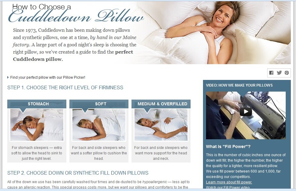
Product information example from Cuddledown

  • Retailers should emphasize exclusives. Whether individual items made or offered exclusively through their brand or product combinations found nowhere else, unique offerings should be highlighted on retailer sites, giving shoppers incentive to act.Mass merchant Kohl’s spotlights exclusive products by designer Derek Lam in the women’s category, noting that the collection is “Limited Edition. Limited Time.” and using video to engage shoppers with the story behind the apparel.
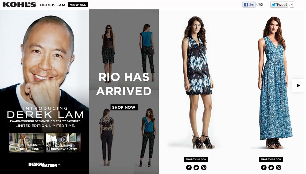
Exclusive product example from Kohl's

What eCommerce trends top your list of priorities for the coming months, and why?
A different view of thinking visually

We’re still processing all the ideas exchanged during last week’s MarketLive Summit, our annual gathering of MarketLive merchants, technology partners, and guest experts. There was valuable information presented at every turn, from inspiring keynote speeches to nuts-and-bolts breakout sessions and training seminars.

One thread from the opening day’s keynotes resonated with our recent post on thinking visually — or rather, jarred loose a few assumptions. Tim Ash of Site Tuners gave a bracing keynote titled “Why Your Online Catalog Sucks (And What to Do About It)” which revealed how shoppers actually use web sites, as opposed to how merchants design them. He urged merchants to validate new site concepts with user testing, rather than just internal vetting, and to jettison ideas that didn’t contribute directly to boosting conversion.

Ash demonstrated how the power of imagery can either significantly enhance a site — or overpower shoppers with the wrong message. The takeaway? Merchants experimenting with new modes of visual selling must balance aesthetics with utility — starting with these tips:

Motion requires cohesion.  Humans are hardwired to pay attention to motion, Ash noted: we have 220 degrees of motion perception, as opposed to just two degrees of detailed visual acuity. For merchants, that means elements involving motion are bound to dominate viewers’ attention to the exclusion of the rest of the page; home page slide shows promoting a variety of offers and products can contribute to a sense of chaos, as well as rendering the rest of the page nearly invisible.

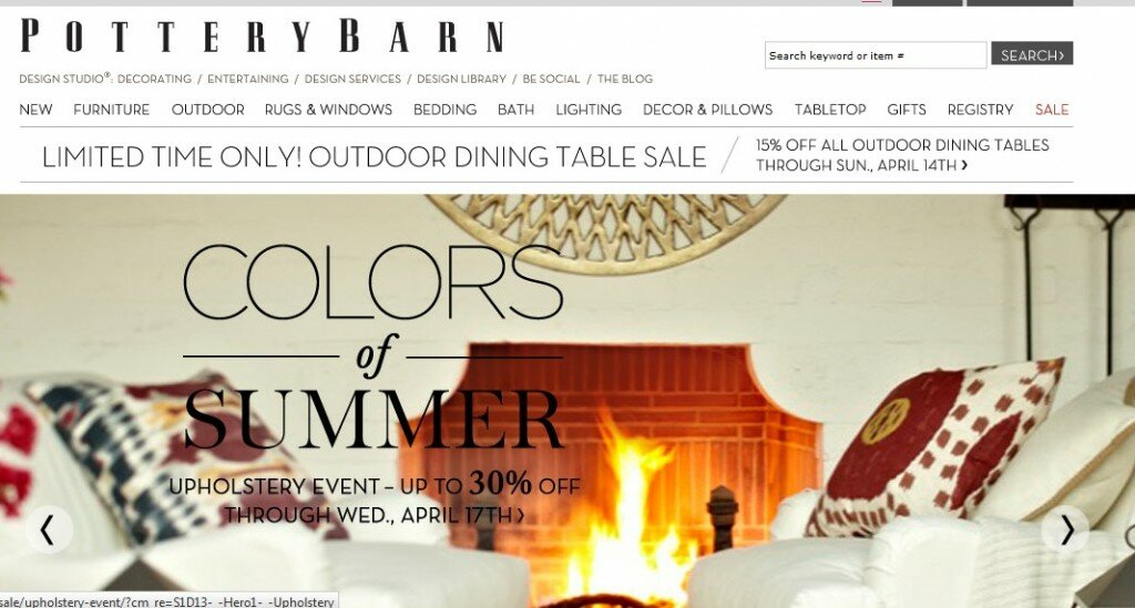
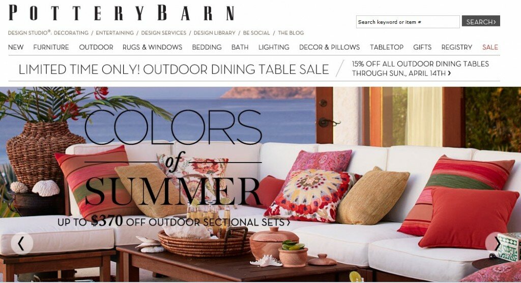
While scrolling elements are unlikely to disappear from the landscape any time soon,  merchants must be judicious in their use. Throwing a grab-bag of promotions into a slide show is no substitute for editing; scrolling displays should have a through-line of theme, tone and message and should support the brand’s overall identity. Pottery Barn ties together its home page slide show with the tagline “Colors of Summer,” showcasing a variety of housewares for the upcoming warm-weather season.

Imagery example from Pottery Barn

Imagery example from Pottery Barn

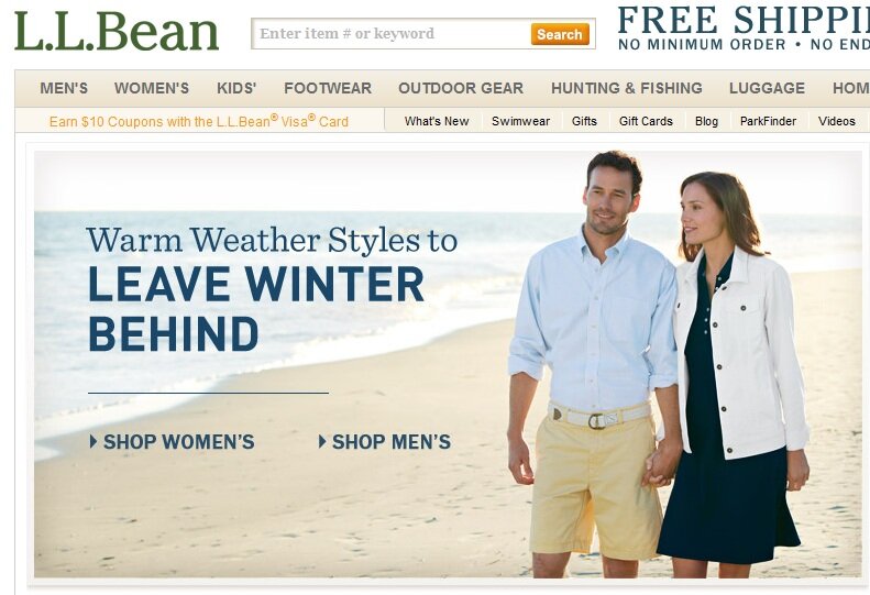
Choose heroes wisely. While too many images can overwhelm viewers, too few can be limiting. Ash displayed several sites whose single main home page image did little to convey the breadth and depth of the product offering — whether because a graphic touted a sale (without showing what products were discounted) or because a photo showed just one ensemble or item from a single category on the site, potentially leading viewers to believe only women’s apparel was available, for example. Merchants should divide home page real estate to display multiple images for several major categories, use personalization to serve the most relevant array of images for returning visitors, or choose a “hero shot” that demonstrates the array of products on offer, as L.L. Bean’s featured image does by showing both a male and female model.

Imagery example from L.L. Bean

Use images as organizers. Because images can convey so much more information quickly than text, Ash advocated using them to help browsers quickly comprehend category organization. The key is to create custom, composite images that accurately reflect the array of products within a category, rather than selecting a single item to represent the whole, which can mislead shoppers into thinking the selection is limited to what’s literally on display. B&H Photo’s home page offers shoppers a visual guide to the site, displaying images for each major category that instantly convey the array of goods on offer — such as the tripod and camera with boom mic and eyepiece for “Professional Video.”

Imagery example from B&H Photo

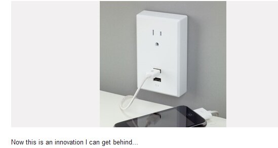
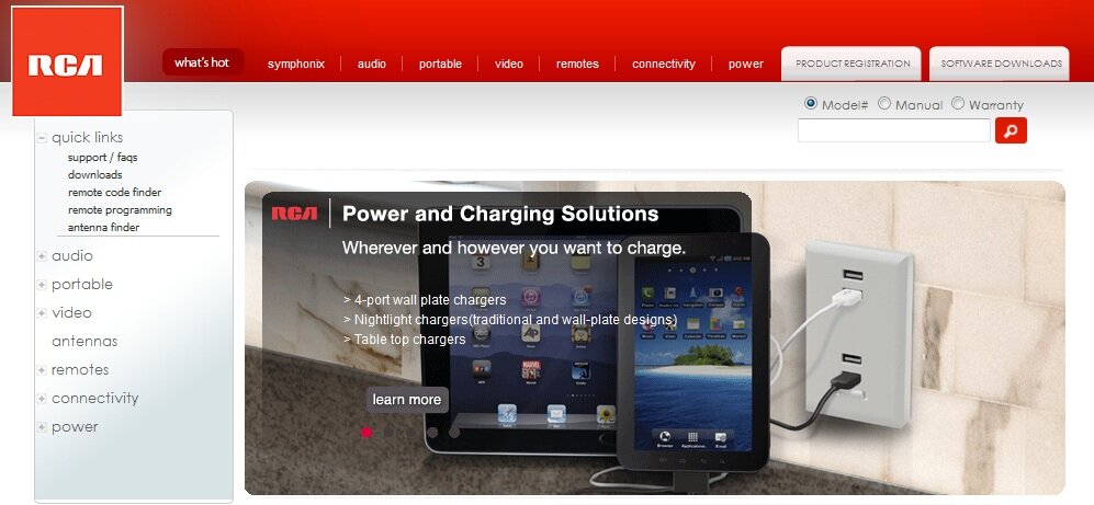
Use social images with staying power. Ash didn’t touch on social media during his presentation, but a snippet from fellow keynote speaker Sucharita Mulpuru dovetailed with his usability-centric theme. According to Mulpuru, who’s principal eCommerce analyst at technology researcher Forrester,  fully 70% of links on the visual social network Pinterest are dead ends, presumably in some cases because the featured products or offers are no longer available. And the phenomenon surely isn’t limited to Pinterest; with merchants now able to embed product links into photos shared on a variety of social media, and with consumers now able to redistribute those images freely, merchants must have a strategy re-routing defunct product links to relevant category or index pages. At the very least merchants should offer an “item not found” page that displays relevant alternatives based on the original product. Pinterest users clicking on a year-old link to an individual RCA product that’s presumably no longer available are routed to the home page, where the main display features links to related items in the power and chargers category.

Pinterest example from RCA

Redirect example from RCA

How are you balancing aesthetics and usability when creating image-rich features?

Guest Post: Bronto – Understanding the Near-Customer Experience

By Jim Davidson, Manager of Marketing Research at Bronto Software ()

The 2013 MarketLive Annual eCommerce Summit for MarketLive clients and technology partners is quickly approaching. I’m looking forward to my session “Learning from the Best: Email Tactics of Top Performing Retailers” and want to share one of the themes that is starting to shape what you will see in my presentation at the Summit.

Either your eyes glaze over or your ears perk up with someone says “Abandoned Cart strategies.”  Three quick facts:

  • ~70% of carts are abandoned
  • ~20% conversion rate for abandoned cart reminder emails (without incentives, mind you)
  • Only 13% of brands send abandoned cart reminder emails

That boils down to 87% of brands leaving money on the table … or at least in the cart.

As marketers, we are all familiar with the importance of engaging the customer during this period when interest is extremely high and the purchase decision is teetering on factors like additional taxes, shipping costs and potentially impending buyer’s remorse.  Be careful though; by limiting your recovery strategies to those who actually added items to the cart your focus may be too narrow.

Consumers have become increasingly distracted and it seems like they like it that way.  Sales on mobile devices are showing no signs of slowing down.  A study by Google reported that 80% of consumers planned to use multiple devices simultaneously when shopping.  They are not simply switching between devices, they are using both at the same time. These distracted, device-shifting consumers need consistent courting even before they add items to the cart – so I ask you to broaden your focus and explore the broader concept of the “Near Customer.”

“What is the ‘near customer’ concept,” you ask? For the most part, it means that your marketing efforts have worked well.  You have engaged your customer, you have promoted your product and they are really, reallllllllly super-duper close to buying, yet they abruptly leap out of the purchase process.  This behavior is not limited to the shopping cart. No, cart abandoners are not the only “near customer” who should get your attention.  With the barrage of marketing messages in the inbox and across a typical consumer’s devices, purchase decisions that once were further down the funnel are taking a step back.  Luckily, technology and automation has taken a step forward.

Two situations can lead to abandonment by the near customer even before an item is carted.  Luckily both scenarios benefit from automated reminder emails similar to abandoned cart reminders.

Lane Changers
85% of shoppers will shop on one device and finish on another, according to that Google study.  They are abandoning the shopping experience on one device though there is intent to revisit the purchase later.  Perhaps someone is clicking through an email on their phone and they plan to buy later on their laptop over the weekend when they have more time to check out the product, read reviews and comparison shop.  It’s not just a few folks who are doing this; 85% represents a majority of shoppers.  If you are not engaging this group in a way that makes this process convenient and streamlined, then the purchase could be forgotten by the shopper or they may find an alternate product on your competitor’s site. From the same report, 45% of consumers will use bookmarks, the shopping cart or will send emails to themselves as a way to put their shopping process in temporary suspended animation.  Those solutions sound simple, but they put the onus of transitioning from one device to another on the consumer, who is likely busy enough without having to do the work of enabling cross-touchpoint shopping – that’s your  job. Take some of the burden off of your shoppers’ shoulders by offering services like wish lists or “save for later” options.  This is one method of capturing both the shopper’s intent and the specific product information – that’s fuel for your automated reminder email.

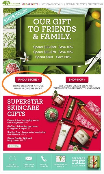
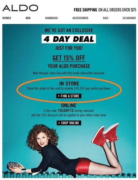
These examples show how retailers are making it easy for their shoppers to show emails on their mobile phones to receive discounts in-store.

Email example from Origins

Email example from Aldo

Product Page Drop-outs
You call it a “marketing mix”, but to your customers it may seem like a game of dodge ball.  The balance of having your marketing messages present in various channels and on various mediums is essential to driving sales.  As the number of places a shopper can see your message expands from the inbox (on their computer, phone and tablet), display ads, your catalog, Facebook, Twitter, Pinterest, Instagram, YouTube, and so on, you may see an increase in your shoppers popping in to take a quick glance at what you are selling, and then leaving without taking further action.  Think of this as an advanced form of window shopping.  How many times have you walked in a store and told the employee, “Thanks, just looking”?  This is happening on your site.  Are you going to let this near customer just walk out or are you going to engage them, communicate your value proposition and remind them why they should buy from you? An automated program targeted to product page abandoners is an increasingly important campaign to have in your arsenal.  Those of you who do have these emails in place may also find that there is room to improve the message.

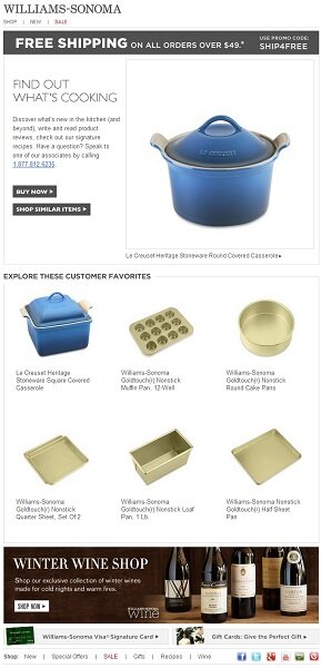
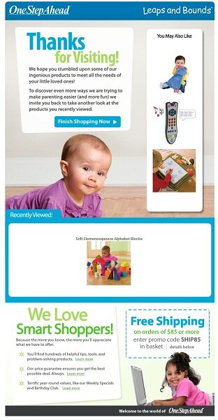
These examples thank the customer for visiting their site, shows the browsed product and  feature related recommendations.

Subject: line: “Thanks For Your Interest In: Le Creuset Heritage Stoneware Round Covered Casserole”
Email example from Williams-Sonoma

Subject: line: “Thanks for Visiting! Shop Now and Receive Free Shipping”

Email example from One Step Ahead

While some of you may feel that launching these programs puts you in the weighed down sludge of “big data,” the data needed to engage and sell to the near-customer is likely at your fingertips and after the initial set up, the automated processes will run without any drain on time or resources.

In addition to other automated message programs and revenue generating email campaigns, we will explore real-world examples and results of the near customer experience strategies during my session at the Summit. I hope to see you there! Please feel free to send any examples that you would like for me to evaluate and potentially include in my session: .

And meantime, everyone should tune in to a Webinar tomorrow, March 27 at 10 a.m. Pacific, for more Bronto and MarketLive expertise, this time on the subject of post-purchase email marketing. Register now!

WordPress SEO fine-tune by Meta SEO Pack from Poradnik Webmastera