Top connected commerce priorities: Inventory and fulfillment

Most merchants understand the concept of connected commerce — providing a seamless shopping experience across channels and devices. But for merchants working with limited budgets and clunky standalone technologies, the goal can seem overwhelming and elusive.

New research suggests that inventory and fulfillment integration tops the list of consumer priorities. In a talk at this year’s Internet Retailer Conference and Expo, Lauren Freeman of The eTailing Group revealed results of a consumer survey that found . Specifically, consumers rated the following features as important influencers of their purchase decisions:

  • Not surprisingly, nearly two-thirds of online shoppers — 62% — wanted the ability to have items purchased online delivered to their homes.
  • But more than half of shoppers rated as important the ability to get the product within a day or two. Depending on the cost and availability of expedited shipping, for some shoppers the only way to meet this criteria is through in-store pickup or purchase.
  • Fully 45% of shoppers wanted to know whether items researched online were available to purchase locally at a physical store.
  • The ability to purchase online and pick up in store was rated as important by 33% of shoppers.

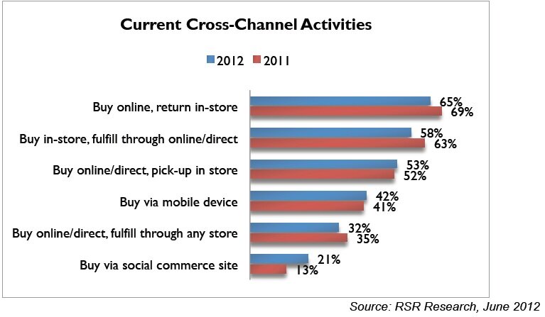
The upshot? For merchants still struggling to begin integrating business processes, inventory and fulfillment should top the priority list. Furthermore, those who already offer such capabilities should highlight them as a differentiator. Just over half of merchants offer in-store pickup for items ordered online, according to a new multi-channel report from RSR Research — and the percentage of merchants offering in-store returns of items ordered online has dropped compared with 2011.

Data about cross-channel integration from RSR Research

To promote delivery flexibility and inventory visibility, consider the following tactics:

Put the emphasis on speed and savings. Most merchants offering in-store pickup position it as a free alternative to home delivery — a factor worth highlighting, given that most shoppers seek savings on shipping costs. In addition, merchants who can promise instant availability in stores should promote speed as a benefit so that shoppers understand they won’t need to wait for an item to be delivered to their local outlet. Sears promotes instant in-store availability in a global promotional banner which promises shoppers can “get it today with free in-store pickup.” The product page drives the message home with a tabbed display that highlights free in-store pickup along with current free home delivery offers.

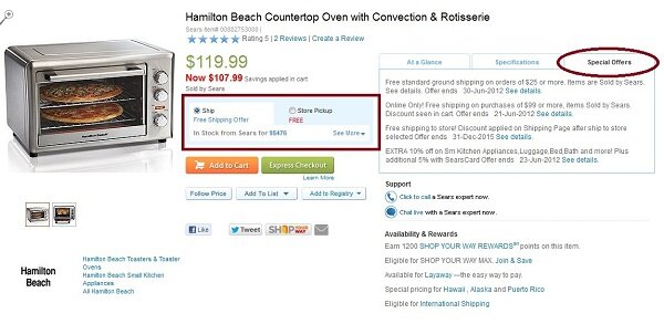
In-store pickup promotion from Sears


In-store pickup example from Sears

Don’t forget mobile. The ability to view in-store availability and flexible delivery options is especially important for shoppers on the go, so  put in-store inventory and pickup front and center when designing your mobile commerce offering. Walmart gives “Find in store” equal footing with the “Add to cart” button on the mobile product page as well as displaying in-stock status and the ability to select free shipping to stores for online orders. Clicking “Find in store” displays inventory levels at stores within a 50-mile radius of the shoppers’ current location, with a link to store directions listed along with the phone number and item number.
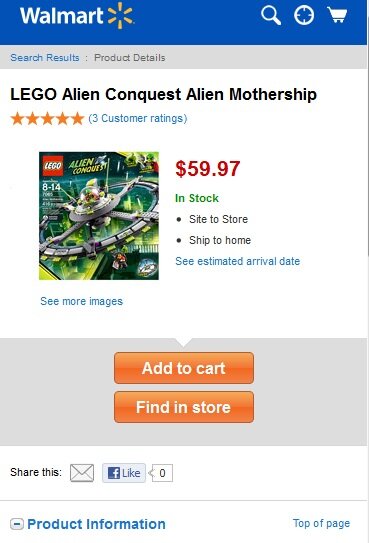
Inventory example from Walmart


Have you integrated in-store inventory and cross-channel fulfillment into your eCommerce site and mobile offerings? If not, what’s holding you back? If so, how do you promote the service?
 

Webinar recap: Unboxing your content

Wednesday’s webinar on content for connected commerce included a bevy of great examples and tips — if you didn’t catch it live, you can view the replay and download the associated whitepaper.

A key takeaway from the session: The importance of thinking “outside the box” when it comes to content. Specifically:

Find new ways to present content for every stage of the customer lifecycle. It’s easy for merchants to rely on tried-and-true content strategies; for example, by now most merchants include customer reviews and multiple images on the product page and have launched social outposts for connecting with brand followers using targeted discount offers and lifestyle-related posts. But to ensure content is relevant for shoppers at every stage of their engagement with the brand, and to create an immersive content experience that spans devices and channels, it’s helpful to think outside the box. For each phase of the customer lifecycle, consider which medium is best for the message:

  • Product content. Most typically associated with the eCommerce product page, product content provides all the details about the merchandise itself. It can take many forms, such as how-to videos, care instructions and color swatches.
  • Value-added content. At one remove from the core product content, value-added content inspires shoppers to make purchases by demonstrating how the brand and the products serve their needs. Buying guides, fashion look books, tips, how-tos and even customer service content such as store locators and return policies and guarantees all fit in this category.
  • Social content. Social content resides in that fluid boundary where brand-issued material such as blog entries and Facebook posts mixes with user-generated input such as customer reviews and comments. It’s a rich medium for engaging shoppers, generating conversation about the brand, and receiving feedback.

The content matrix below shows each stage of the customer lifecycle along the left-hand side, and then the three classifications of content in columns to the right. To optimize your content, consider new ways to fill in slots on the grid.

eCommerce content planning matrix from MarketLive

For example, material related to getting customer service help seems to fit most readily in the “value-added content” bucket – but MarketLive merchant Gaiam has gone above and beyond by providing customer-service-related product content, in the form of detailed specs that might otherwise trigger a question to the call center. In addition, Gaiam has created social customer service content using its Q and A feature, which allows staff and customers to respond to questions about products posted by shoppers.

Example of customer service content from Gaiam


Social customer service content from Gaiam


Use manufacturer content as a starting point. Questions during the Q and A period of the webinar focused on how to use manufacturer content most effectively, given that search engine algorithms favor original material. Ideally, every merchants would create wholly original content for every product; but in the real world of limited resources, using manufacturer content is often a necessity. The key is to “unbox” the content, repurposing it for your target audience and integrating it fully — not just cutting and pasting. For example, MarketLive merchant Title Nine features a skort by manufacturer Mountain Hardwear on its site — but rather than simply reposting the manufacturer’s bulleted list of features, such as “Wide low-profile waistband for comfort,” Title Nine translates for its audience of fitness-conscious women. The product name is “Do-It-All SWB”, or Skirt With Benefits, and the description cites the skort’s “Wide, yoga-inspired waistband”.

Original manufacturer content from Mountain Hardwear


Product description adaptation example by Title Nine


MarketLive merchant Sport Chalet has made the most of robust manufacturer content by building immersive environments around the “Shop by Brand” concept. Not only does the eCommerce site feature a section full of brand content such as videos and fit guides, but the content is carried over into email campaigns and specialized landing pages, as in this example from Brooks. The email compels recipients to click on to the landing page, whose look and feel match the original message and whose content gives shoppers key information about what makes the Pure Project product line unique. The eCommerce Web site section dedicated to Brooks Pure Project features detailed technical information and videos.

Brand-focused email from Sports Chalet


Brand content example from Sport Chalet


Brand content example from Sport Chalet

How are you unboxing new content opportunities for your business?


It’s a common experience nowadays: A brand’s Web site has comprehensive content, but the Facebook page is barely populated. There’s a Twitter feed full of helpful tips, but none of that information is listed in the customer service section of the company’s mobile offering. Email marketing doesn’t match mobile messaging. A search ad landing page fails to incorporate relevant customer reviews.

We’ve all heard the mantra “content is king.” Rich content that helps shoppers connect with products can not only smooth the path to purchase, but can boost brands’ relevance when it comes to search engine rankings.

The good news is that the volume of shopping content is growing as merchants manage brands across a growing number of customer touchpoints. But the bad news is that the content is often disjointed and sprawling, just when consumers’ expectations are higher than ever for cohesive, relevant information. One indicator of these heightened expectations is the “1-and-out,” or bounce, rate, which measures the percentage of visits ending after just one page. According to the MarketLive Performance Index, the “1-and-out” rate increased more than 12% from Q4 2010 to Q4 2011 alone. More shoppers than ever are abandoning sites almost as quickly as they arrive, indicating their impatience and lack of willingness to go deeper into a site that doesn’t immediately seem to address their needs.

MarketLive Performance Index data about bounce rates

With shoppers ready to click away from sites at a moment’s notice, it’s up to merchants to communicate relevance instantly — a challenge that requires a cohesive, well-considered content strategy. Moreover, as online shopping competition intensifies, great content can create new pathways to purchase. With search engine algorithms being increasingly fine-tuned to give preference to authentic content, merchants can score big SEO wins for unbranded keyword terms by creating comprehensive lifestyle content that demonstrates the brand’s expertise.

MarketLive chart showing new pathways to purchase via lifestyle content

MarketLive’s Optimized Commerce: Content Webinar Wednesday will address how merchants can plan their content to address shoppers’ needs, create effective content across customer touchpoints, and assign tangible success metrics so content can be monitored, evaluated and modified.  There’s still time to register, so sign up now and join in at 10 a.m. PDT Wednesday, June 20.

Meantime, what strategies do you employ to create and maintain great content?

3 new reasons to use alternative payments

Alternative payment services such as PayPal, Bill Me Later and Google Checkout are now commonplace on eCommerce sites, with good reason. Industry researcher Forrester estimates that fully one in five eCommerce transactions are completed using alternative payments, reaping merchants $64 billion in U.S. sales. That percentage will grow to nearly one in four — 23% — in the next four years, Forrester predicts. It’s not surprising, then, that when we surveyed checkout processes last fall, nearly 60% of the largest U.S. merchants already used alternative payments.

While the prospect of implementing a new payment process may cause logistical headaches, we believe merchants should make the project a priority. Alternative payment options smooth the path to purchase for Web shoppers — and new research suggests alternative payments are crucial for expanding into new channels and markets. Alternative payments:

1. Facilitate mobile buying. In a study of mobile purchases made over the past two months, 67% of those transactions were completed using an alternative payment system versus a credit card, according to a study from eCommerce provider ShopVisible. By giving shoppers a way to avoid entering credit card payment details, alternative payments help overcome two top barriers to mobile purchasing:

  • Convenience.  In the 2011 MarketLive Consumer Survey, conducted prior to the holiday season, the top reason shoppers gave for not making mobile purchases was “shopping is still too awkward on my phone” — an opinion shared by 37% of survey participants. Alternative payments help speed the purchase process.
  • Security. Nearly one-third of consumers are anxious about sharing credit card information over their mobile networks, the MarketLive Consumer Survey found. With alternative payments, shoppers need only enter a username and password, and their financial information isn’t shared.

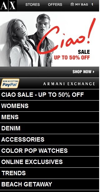
To reassure mobile shoppers who are hesitant to become mobile buyers, merchants should highlight the availability of alternative payments within their mobile shopping environments, as MarketLive merchant Armani Exchange does on the home page and category pages within its mobile site.

Alternative payment example from Armani Exchange

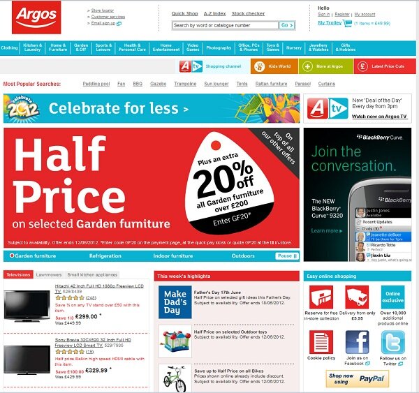
2. Appeal to international customers. For merchants casting an eye toward the rapidly-growing European eCommerce market, alternative payments are a must. PayPal is used by half of online shoppers in the U.K. and Germany, and by 40% of European online shoppers overall, according to Forrester.  U.K. mass merchant Argos highlights its PayPal service on the eCommerce site home page in a promotion messaging “easy online shopping.”

Alternative payment example from Argos
3. Connect online and offline purchasing. With 15 major merchants now planning to use PayPal at physical store point-of-sale terminals, alternative payments are becoming a means for consumers to make purchases wherever they roam. Such integration creates a seamless shopping experience for buyers, while for merchants, the ability to track purchase data across channels and devices helps build a holistic profile of customer behavior.

How are you promoting alternative payments? If you haven’t yet adopted alternative payment systems, what’s holding you back?


Updating your global header: What’s hot — and what’s neglected

Back in the olden days — say, 10 years ago — designing an eCommerce site global header was relatively straightforward. Of course devising the right lineup of product categories and navigation items has always been as challgening as it is crucial. But otherwise, back then the global site header needed to serve only a few more functions —  to convey the brand’s identity, connect shoppers with customer service and physical stores, and perhaps offer a means for signing up for email updates. Simple, right?

2005 global site header example from Office Depot


Nowadays, the job is far more complex. In addition to displaying product categories, on-site search, and customer service links, designers are often asked to shoehorn in an array of promotions, social networking links, account functions and merchandising categories.

2012 example of global site header from Office Depot

As the example from Office Depot from 2005 (top) and this year (immediately above) shows, there’s now a lot more to juggle in what’s still a relatively small — but crucial — amount of real estate. So, how should merchants proceed?

To answer that question, we surveyed a selection of the 50 largest sites from the 2012 Internet Retailer Top 500 and tallied what’s in their headers.

Data on elements of the global site header

The results point to a few general trends:

  • What’s in: Promoting functionality. Merchants are going beyond offering an account login for registered customers; they’re spotlighting the ability to track orders and save products to wish lists and registries. Furthermore, on-site search (which was featured in every site header we visited) often offers a drop-down filter option to help shoppers
  • What’s out:  Static signup invitations. Email subscription links that are anchored in the header are fairly uncommon, with less than a third of merchants using them in the global header. Somewhat surprisingly, those links haven’t been replaced by invitations to “follow” brands on social networking sites; static links to Facebook, Pinterest and Twitter are featured on only 14% of sites.
  • What’s hot: Flexible promotions. Merchants are using the global header like never before to include marketing messaging, with 80% of sites we surveyed featuring a promotion of some type — such as the free shipping offer and link to the print ad in the recent Office Depot example. Seasonal features, enticements to sign up for mobile alerts and links to sale categories often rotate, banner-ad style, in the header space.
  • What’s neglected: Customer service links. More merchants were using the global header for promotions than for a link to customer service, which was only featured on 68% of sites —  a dangerous oversight. Putting customer service help within easy reach is crucial to winning shoppers’ trust and helping them complete purchases. If you can’t devote space to displaying every available customer service option, such as a live chat link and an 800 number, then at least include a link to “Customer Service” or “Help”
  • What’s smart: Highlighting gift cards. Gift cards are an ever more popular option — for example, they comprised more than 18% of total 2011 holiday sales, an increase of more than 20% over 2010.  So placing links to gift cards in the global site header is a smart move.

With these trends in mind, use the following tactics to update and optimize your global header:

  • Organize links with colors, layers or both. Help shoppers navigate a thicket of options with design techniques that group sets of links together. Many sites now employ horizontal bands in different colors, with one layer for service links such as account login and another for product navigation. Mass merchant JC Penney goes even further, with a grey band at the top offering links related to individuals’ accounts, such as “track my order,” and then a middle layer that includes searc and popular links such as “May books”, “find a store,” and “gifts,” above the standard product category navigation. A fourth layer promotes free shipping in a bold green banner.

Global site header example from JCP

  • Don’t let search get lost in the shuffle. More than a third of shoppers use on-site search, and those users tend to complete purchases at a higher rate than other visitors, according to volume 15 of the MarketLive Performance Index — so ensure the search box stands out among all the other links and functions in the global header. On the Barnes and Noble site, the search box stands out despite being on a pale background, thanks to blue and green border coloring and black type in the box itself promoting the site’s 30 million products, along with a drop-down box for filtering results.

Global site header example from Barnes & Noble

  • Consider a floating footer for secondary links. Using a footer that remains visible at the bottom of the browser window as shoppers page and scroll through the site gives you another highly visible option for key links. Land’s End uses its universal floating footer for customer service links and a gift card promotion that includes an eye-catching graphic.

Global site header and footer example from Lands' End

  • Test, test, test. Give every link and label in the global site header the same consideration you use when devising product categories and navigation schemes — and that means testing, tweaking and refining. As with everything else, over time your global site header should adapt to the changing needs of your business.

What elements are in your global site header? How have you tweaked the design over the years?

WordPress SEO fine-tune by Meta SEO Pack from Poradnik Webmastera