The value of thinking long-term

By now, merchants know that connecting with shoppers across touchpoints is crucial to their business — but quantifying the interaction of channels and and influences remains elusive. So it’s helpful to see new data from Google that shows just how important it is to maintain well-rounded, cohesive messaging. The interactive report “” parsed transactions from more than 35,000 sites using Google Analytics to demonstrate how a mix of influences convert shoppers to buyers.


Crucially, the report analyzed the length of the customer journey as well as the variety of touchpoints, and found that in retail, fully 50% of revenues are generated by purchases made over more than one day of interactions. Not only that, but a whopping two-thirds of revenues are generated by purchases that take place after more than one interaction — and the average order value for purchases rises as shoppers have more interactions with a brand. Compared with the average order value of a purchase made after one transaction, purchases made after about 10 interactions are 50% higher, and the average order value keeps rising (although incrementally) from there.

Data from Google on number of interactions before purchase

The data suggests that merchants need to rethink their messaging and strike a balance between enticing shoppers to buy immediately and building the long-term brand connection that pays off in the longer term. Among the strategies to consider:

Use “flash sale” style promotions wisely.  The popularity of flash sale sites such as RueLaLa, Zulilly and Woot! has prompted retailers to tap into the daily-deal mindset with extremely limited-time offers that expire after a day or even just a few hours, often focusing on a single product. Such promotions can drive signups for email or mobile alerts on daily deal products and spur increased engagement with products on the Web site as shoppers are exposed to an array of fresh products. To encourage still further engagement across brand touchpoints, merchants should layer in longer-term messaging, using secondary positions in email promotions and on landing pages to encourage shoppers to keep coming back even if the featured discount doesn’t spor them to buy. Victoria’s Secret’s email promotion featuring a one-day sale on bikinis uses a secondary banner position to promote dollar-off discounts not tied to a particular product category, thereby appealing to shoppers not on the hunt for swimwear.

Flash sale example from Victoria's Secret

Use layers of social media interaction to spur long-term engagement and sales. Merchants should find ways to go beyond posting promo codes and product links to create a truly participatory experience for brand followers that leads inexorably to purchasing. American Eagle devised a months-long contest that spawned content across touchpoints and encouraged product browsing. Followers were first asked to vote for “real life” models for AE’s spring 2013 campaign on Facebook; the winners were featured in video profiles on the AE.com blog and their top product picks were displayed on Pinterest, leading followers to engage  on multiple social platforms. Finally, those same contest winners appeared on the AE.com site as product models in shoppable collections.

Social media example from American EagleSocial media example from AE

Social media example from AE

How do you build long-term engagement with your brand?

Two reasons to use structured markup

Merchants looking for new ways to optimize their sites for better placement in organic search results listings are accustomed to focusing on content, and specifically on the substance of the text and images on their sites’ pages. But another aspect of that content is increasingly important — the structure of the information, as presented in the back-end code of the page.

As presenter Richard Chavez of PM Digital outlined in his SEO presentation at the recent MarketLive Summit, merchants can now tag discrete pieces of content within a given page, making those snippets easier for search engines to parse, recognize and display within search results listings. Elements such as videos, the average rating for a product, the price, and search-engine friendly descriptions can all be called out by these specialized tags.

This structured data isn’t exactly new; its widespread adoption began in the spring of 2011, when Google, Microsoft and Yahoo announced a joint effort called Schema.org to standardize tagging of page elements. But structured data took on especially heightened significance for merchants as of November of 2012, when Google integrated a set of specialized eCommerce vocabulary called GoodRelations into Schema.org — radically expanding the number of potential attributes merchants could tag. The number of product-specific properties grew from eight to 25, and the number of offer-specific properties allowing merchants to tag price and discount information grew from 10 to 27, according to Search Engine Land.

While the prospect of retagging their sites may give merchants pause, adopting structured data should be a top SEO priority. Two of the many reasons why:

Enhanced search results listings have higher click-through rates. Sites implementing structured markup can see a 30% increase in traffic from organic search engine results, according to content management system provider Webnodes, while GoodRelations claims search result listings using structured markup achieve 30% higher click-through rates than unmodified listings. Among the unsponsored listings for “Cole Haan ballet flats”, the video from Zappos and the rating summary from Bloomingdales are more eye-catching than the top two results from the manufacturer and Amazon. The listings for Bloomingdales and Nordstrom incorporate custom descriptions that are both concise enough to be displayed in their entirety and catchy enough to encourage further engagement. “How could a chic, flexible ballet flat get any more comfortable?” asks the Bloomingdales copy, while the Nordstrom description calls attention to details such as “Diminutive drops of gold” and “comfy Nike Air.”

Structured markup example for shoes

Markup helps physical locations stand out.  By calling out individual store details with specialized tags, merchants can achieve greater visibility for their physical outlets, with the address, phone number, events and even hours listed in the search results listing — an advantage that’s especially crucial for mobile search results, streamlining access to information for on-the-go shoppers. On a smartphone, REI’s individual store location listing, which is tagged with structured location markup, consumes most of the screen, with not only a map, but store hours and a click-to-call icon integrated into the display.

Structured markup example for REI

To learn more about structured markup, read the “Getting Started” guide on Schema.org. And check out Google’s , which displays what structured markup is detected on pages, and , which enables tagging of page content without recoding.

Are you now using structured markup, or do you plan to do so? Why or why not?

Getting real with the trends – MarketLive Summit report

Setting priorities is always a top challenge for merchants, what with the whirlwind pace of change in the world of online commerce combined with the need to abide by limited budgets. Thankfully, attendees of last week’s MarketLive Summit received significant help with focusing their to-do lists, thanks to industry expert Sucharita Mulpuru, principal eCommerce analyst at technology researcher Forrester.

In her keynote presentation, Mulpuru dissected six big trends that have been generating plenty of hype and presented merchants with real-world options — and, in some cases, alternatives — for acting on them. Among her top revelations:

Multi-channel fulfillment: Walk before running. While major merchants are promoting same-day delivery in some regions, Mulpuru noted that even they can’t offer coast-to-coast coverage — and that consumers overwhelmingly opt for “free” over “fast” when it comes to shipping. For that reason, she advised that most merchants should focus on other priorities when it comes to multi-channel fulfillment, including:

  • “Endless aisle” opportunities for in-store sales. Associates should be trained to help shoppers find and buy items online that are out of stock on store shelves. Self-service kiosks and tablet devices for store associates can help bridge the online/offline divide.

  • Order online, ship from stores. Mulpuru noted that merchants offering the ability to shop online and pick up items in stores have a steep hurdle to surmount, as inventory must be available in the location a shopper selects; by contrast, enabling local stores to fulfill online orders speeds delivery and gives merchants the option of tapping inventory from multiple nearby outlets to get the job done.

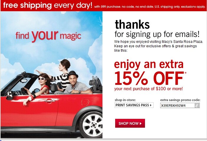
  • E-receipts. Delivering physical store receipts via email gives merchants the opportunity to tie together online and offline shopper activity via the shoppers’ email address. For that reason, it’s a top priority for multi-channel brands, Mulpuru said, with more than 40% of merchants in a recent survey saying they’ve implemented it or plan to do so within two years. Macy’s invites shoppers opting for an e-receipt to sign up for email updates at the same time, then follows up with a welcome email tailored to the physical location, including a discount with an in-store redemption option.

E-receipt example from macy's

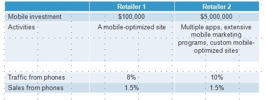
Basic mobile competence is enough — for now. Mulpuru shared deep-dive analytics on mobile shopping behavior showing that while traffic from smartphones and tablets is growing exponentially, most interactions are shallow and brief. For example, while 10.7% of eCommerce site visits originate on smartphones, just 7.6% of pageviews do — and average conversion is a dismal 0.5%. And she shared dramatic results from two merchants demonstrating that a large investment in mobile doesn’t necessarily translate into higher conversion: both sites garnered 1.5% of online sales from mobile phones, despite vastly different budgets for mobile technology.

Mobile data from Forrester

While it’s possible to interpret this data to suggest that mobile as a whole is overblown as a priority, the fact remains that shoppers do expect to engage with brands via their tablets and phones — so merchants must develop mobile-friendly outposts to meet that demand. And the positive spin on Mulpuru’s data is that even merchants with modest mobile budgets can compete for mobile spending dollars, if they cover the crucial basics we’ve often describeda mobile-friendly shopping experience that incorporates long-standing eCommerce best practices and an easy mobile payment process chief among them.

Brand uniqueness counts more than ever. Using the phenomenon of dynamic pricing as a starting point, Mulpuru led Summit attendees through a fascinating discussion of how the legal underpinnings of commerce have shifted in favor of manufacturers, giving them increasing power to determine how and at what cost their goods are sold — a trend that may well give Amazon and other mega-merchants pause in their race to sell products at the lowest price point. Mulpuru urged merchants to stop obsessing about dynamic pricing and put the focus on products and brands that couldn’t be commoditized — that is, the unique offering that makes their brand a fit for their target audience. Among the practical applications of this recommendation:

  • Brand manufacturers should be the go-to resource for information about their products. Brand manufacturers can compete online for direct-to-consumer sales — and have a distinct advantage in that they are the original experts about their products. Manufacturer sites should reflect that advantage by giving shoppers encyclopedic product information in a variety of formats. Bedding manufacturer Cuddledown provides numerous buying guides, videos and other shopping tools, including a step-by-step guide to selecting the right pillow and a video showing how the pillows are made. A “pillow picker” interactive tool steps shoppers through the process and matches them with individual products.

Product information example from Cuddledown

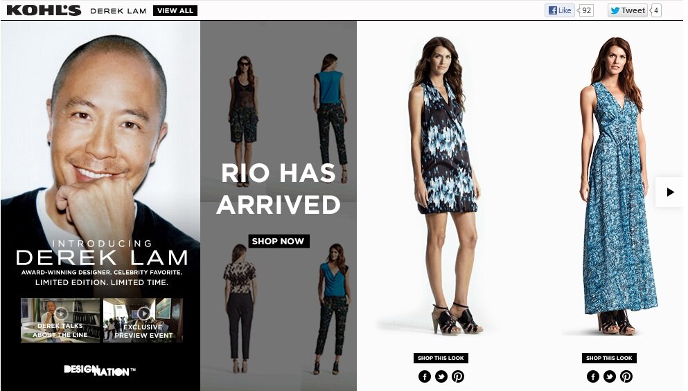
  • Retailers should emphasize exclusives. Whether individual items made or offered exclusively through their brand or product combinations found nowhere else, unique offerings should be highlighted on retailer sites, giving shoppers incentive to act.Mass merchant Kohl’s spotlights exclusive products by designer Derek Lam in the women’s category, noting that the collection is “Limited Edition. Limited Time.” and using video to engage shoppers with the story behind the apparel.

Exclusive product example from Kohl's

What eCommerce trends top your list of priorities for the coming months, and why?

A different view of thinking visually

We’re still processing all the ideas exchanged during last week’s MarketLive Summit, our annual gathering of MarketLive merchants, technology partners, and guest experts. There was valuable information presented at every turn, from inspiring keynote speeches to nuts-and-bolts breakout sessions and training seminars.

One thread from the opening day’s keynotes resonated with our recent post on thinking visually — or rather, jarred loose a few assumptions. Tim Ash of Site Tuners gave a bracing keynote titled “Why Your Online Catalog Sucks (And What to Do About It)” which revealed how shoppers actually use web sites, as opposed to how merchants design them. He urged merchants to validate new site concepts with user testing, rather than just internal vetting, and to jettison ideas that didn’t contribute directly to boosting conversion.

Ash demonstrated how the power of imagery can either significantly enhance a site — or overpower shoppers with the wrong message. The takeaway? Merchants experimenting with new modes of visual selling must balance aesthetics with utility — starting with these tips:

Motion requires cohesion.  Humans are hardwired to pay attention to motion, Ash noted: we have 220 degrees of motion perception, as opposed to just two degrees of detailed visual acuity. For merchants, that means elements involving motion are bound to dominate viewers’ attention to the exclusion of the rest of the page; home page slide shows promoting a variety of offers and products can contribute to a sense of chaos, as well as rendering the rest of the page nearly invisible.

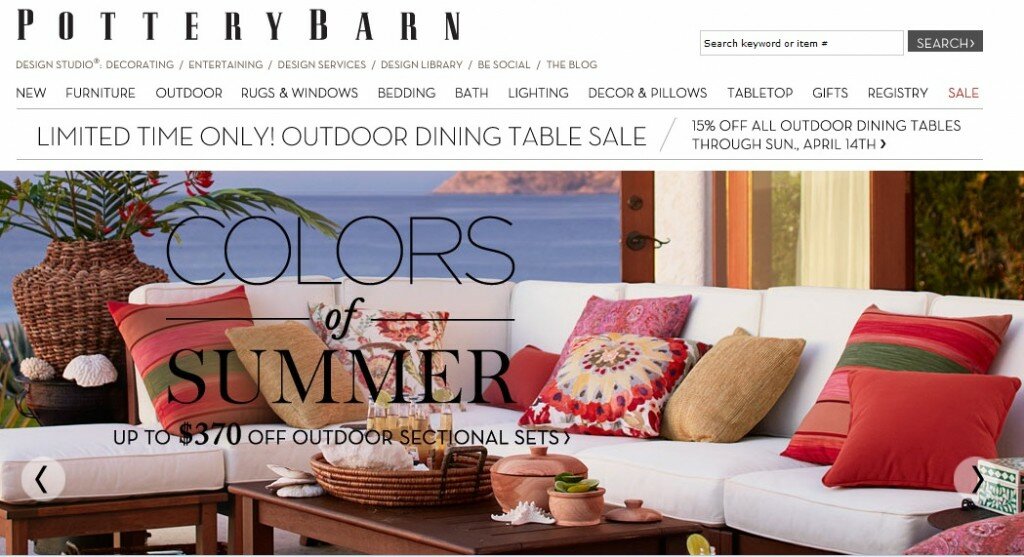
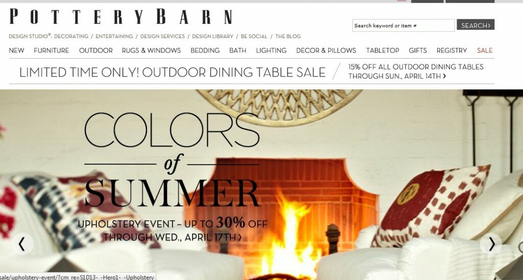
While scrolling elements are unlikely to disappear from the landscape any time soon,  merchants must be judicious in their use. Throwing a grab-bag of promotions into a slide show is no substitute for editing; scrolling displays should have a through-line of theme, tone and message and should support the brand’s overall identity. Pottery Barn ties together its home page slide show with the tagline “Colors of Summer,” showcasing a variety of housewares for the upcoming warm-weather season.

Imagery example from Pottery Barn

Imagery example from Pottery Barn

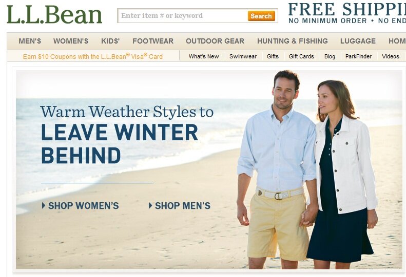
Choose heroes wisely. While too many images can overwhelm viewers, too few can be limiting. Ash displayed several sites whose single main home page image did little to convey the breadth and depth of the product offering — whether because a graphic touted a sale (without showing what products were discounted) or because a photo showed just one ensemble or item from a single category on the site, potentially leading viewers to believe only women’s apparel was available, for example. Merchants should divide home page real estate to display multiple images for several major categories, use personalization to serve the most relevant array of images for returning visitors, or choose a “hero shot” that demonstrates the array of products on offer, as L.L. Bean’s featured image does by showing both a male and female model.

Imagery example from L.L. Bean

Use images as organizers. Because images can convey so much more information quickly than text, Ash advocated using them to help browsers quickly comprehend category organization. The key is to create custom, composite images that accurately reflect the array of products within a category, rather than selecting a single item to represent the whole, which can mislead shoppers into thinking the selection is limited to what’s literally on display. B&H Photo’s home page offers shoppers a visual guide to the site, displaying images for each major category that instantly convey the array of goods on offer — such as the tripod and camera with boom mic and eyepiece for “Professional Video.”

Imagery example from B&H Photo

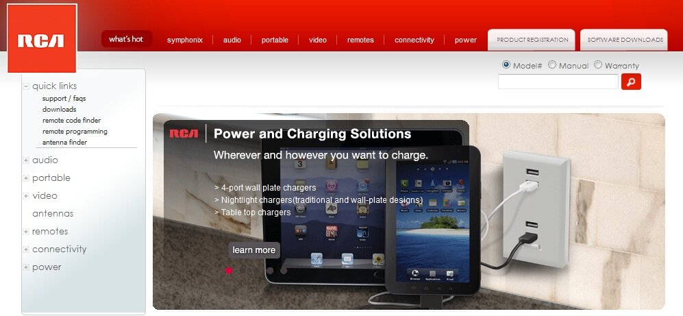
Use social images with staying power. Ash didn’t touch on social media during his presentation, but a snippet from fellow keynote speaker Sucharita Mulpuru dovetailed with his usability-centric theme. According to Mulpuru, who’s principal eCommerce analyst at technology researcher Forrester,  fully 70% of links on the visual social network Pinterest are dead ends, presumably in some cases because the featured products or offers are no longer available. And the phenomenon surely isn’t limited to Pinterest; with merchants now able to embed product links into photos shared on a variety of social media, and with consumers now able to redistribute those images freely, merchants must have a strategy re-routing defunct product links to relevant category or index pages. At the very least merchants should offer an “item not found” page that displays relevant alternatives based on the original product. Pinterest users clicking on a year-old link to an individual RCA product that’s presumably no longer available are routed to the home page, where the main display features links to related items in the power and chargers category.

Pinterest example from RCA

Redirect example from RCA

How are you balancing aesthetics and usability when creating image-rich features?

5 ways to personalize beyond cross-sells

Personalization is becoming increasingly popular on shopping sites large and small, with nearly half of the Internet Retailer Top 500 merchants employing some means of matching shoppers with relevant products based on past behavior or purchases. And new research shows that investments in personalization are worthwhile: according to a recent study from the E-Tailing Group and MyBuys, both awareness and appreciation of personalized offers is on the rise among consumers. Close to half of consumers say they value brands more when tailored product recommendations are offered — an increase of nearly 20% over six months. The percentage of shoppers who say they buy more based on personalized offers via email has similarly grown, by 21%, while the percentage of those who say they buy more based on on-site recommendations has grown by 11%.

Data on personalization from the E-Tailing Group

For merchants, the challenge is how to truly integrate personalization throughout the shopping experience — not just in cross-sells or emails featuring recommended products. Strategies to consider:

Let shoppers actively personalize the experience without registering. First-time site visitors are likely just as eager as frequent buyers to see relevant products — but requiring them to register for an account in order to show them tailored recommendations can be too steep of a hurdle for shoppers unfamiliar with a brand. So devise ways to let shoppers tailor site content and products to suit their needs on the fly, as Destination XL does with its Size Profile. After clicking through five sizing questions, shoppers can opt to “save for current visit” or create an account, and then proceed to browse categories with only items matching their size displayed. They can turn the profile filter on or off at any time from a link accessible in the left-hand navigation.

Fit guide example from Destination XL

Use geolocation — and not just for mobile. Merchants can mine location-based data delivered by the Web browser to deliver relevant site content without asking for it. L’Oreal Paris’ home page features a callout displaying the shopper’s local weather with a beauty tip related to the climate.

Location personalization example from L'Oreal

Similarly, the Home Depot uses geographic data to propose which of its physical store locations is closest to the shopper and uses this information to display in-store product inventory. Even if the location isn’t always correct, highlighting the feature and inviting shoppers to engage and select a different store if necessary calls attention to the depth of in-store information available on the site.

Location personalization example from Home Depot

Make past site activity accessible. Rather than simply mining past visit behaviors to inform product recommendations, merchants should share the data prominently with shoppers themselves, as a prompt to help them recollect what they’ve already considered or even added to cart. Most merchants feature a “recently viewed products” display on product pages, but home goods site Hayneedle.com anchors the tool at the bottom of the page with a floating menu, along with access to the shopping cart.

Recently viewed example from Hayneedle

Outdoor outfitter Cabela’s features recently viewed items prominently on the home page to quickly orient returning visitors.

Recently viewed example from Cabela's

Inform on-site search — including “zero results”. Merchants should use shoppers’ past behavior to weight on-site search results, elevating items in the results set whose brand, size, color or price are similar to previously-viewed items. And they should use that same data to populate the “no results found” page with product recommendations, transforming a potential dead end into a display of potentially relevant items. Shoes.com offers shoppers whose search returns no results a bevy of product options, including items from categories they’ve already browsed and brands they’ve already perused.

Personalization example from Shoes.com

Spotlight the ultimate personalization tool: customer service. While automated recommendations can deliver a relevant experience, there’s nothing like a real human’s discernment to match shoppers with exactly the right products — so merchants should encourage shoppers to connect in person with customer service staff with their questions. Merchants should make customer service access prominent throughout the site and emphasize staff expertise, as jewelry site Blue Nile does when inviting shoppers to connect with customer service, noting that staffers are non-commissioned so have no incentive to sell more expensive items.

Customer service example from Blue Nile

Some merchants have taken this concept even further, offering personal shopping services free to site browsers or as a loyalty club perk. And a small number of online merchants are building new business models premised on the highest level of personal service, such as Trunk Club, which offers men personal shoppers who select ensembles based on style preferences set on the Web site.

Personalization example from Trunk Club

How are you personalizing the shopping experience to drive engagement and sales?

Trend watching: the importance of thinking visually

Merchants have long known that a picture is worth a thousand words when it comes to online selling. According to Internet Retailer’s database of the top 500 merchants, 72.8% of the largest U.S. eCommerce sites offer multiple product views, 85.8% offer an enlarged view of products, and 53.8% use zoom functionality to let shoppers hone in on specific product features.

While such tools greatly enhance the effectiveness of eCommerce site product pages, they’re no longer enough. A growing number of signs indicate that the Internet is becoming an increasingly visual, rather than textual, medium — which means it’s time for merchants to expand their view, as it were, of how to use images to promote their brands and merchandise. Consider these trends:

New technological capabilities process information visually. Building off the growing ubiquity of cameras built into mobile devices, a slew of new technologies enable consumers to take pictures and then retrieve related information from the Internet. Google’s mobile app, Goggles, rather than keywords, while the company’s and promises to give users instant access to information on whatever they’re seeing, without even having to snap a picture.

Google Glass

QR codes that connect consumers to content via scannable codes are also part of the trend; their usage has grown exponentially; fully one in five U.S. smartphone users scanned a QR code as of a year ago, according to data from comScore.

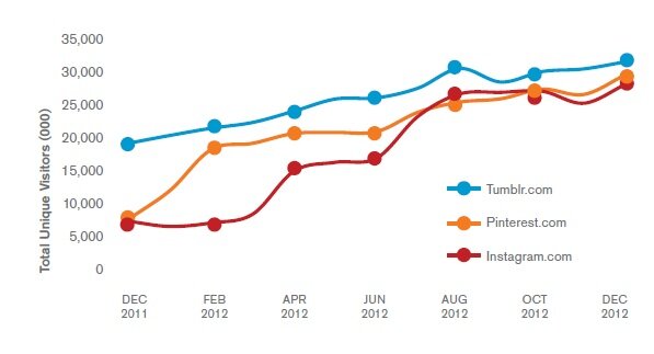
The fastest-growing social phenomena are image-centric. We’ve commented before on the meteoric rise of Pinterest, the social networking site where users share images and links through visually-oriented “pinboards”. But it’s not the only picture-oriented social site that has taken off. According to data from measurement firm comScore, the visual blogging tool Tumblr and the snapshot-sharing site Instagram have also amassed tens of millions of users since launching, and Instagram shares Pinterest’s blistering 284% year-over-year growth rate. The phenomenon isn’t limited to still images, either, with video-sharing tools such as SocialCam, Viddy and Vine rapidly finding audiences.

visualweb Comscore data

Boundaries between screens are disappearing. Fully 58% of U.S. adults go online while watching TV, according to industry researcher Forrester, with tablet computers providing an essential bridge between computer and television: more than 90% of tablet owners use them at home in the living room or bedroom, according to eMarketer — suggesting they’re used for companion browsing while the TV is on — and at the same time they’re large enough to serve as portable televisions themselves, with more than 1 in 3 tablet owners using them to watch movies and nearly 1 in 4 using them to watch TV shows, eMarketer found. This rich mix of visual content and online connectivity is an increasingly ripe opportunity for brands to engage shoppers during leisure hours when they’re receptive to browsing and buying.

For merchants, these trends suggest an emerging imperative to engage shoppers visually at every stage of the customer lifecycle. Now is the time to re-imagine the shopping experience to take into account what Trendwatching.com calls the “Point-Know-Buy” culture, and to experiment with new strategies for combining products, offers and images. A few starting points:

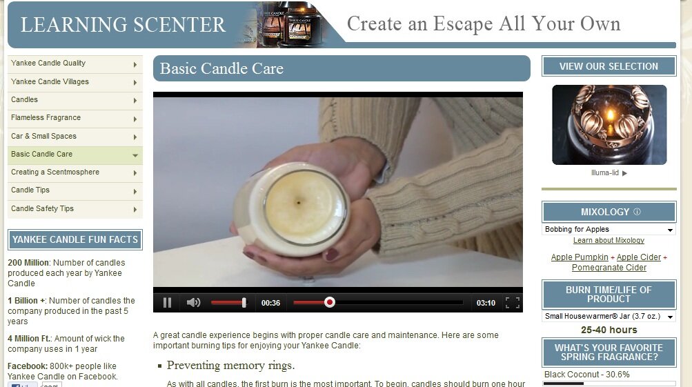
Use video for more than product demos. When devising video strategy, merchants should create compelling content that supports the brand and the lifestyle, not just individual products. How-to content, footage from the brand’s archives, and behind-the-scenes event videos can all enhance the shopping experience visually. Note that these opportunities aren’t limited to brands with “sexy” product offerings such as high fashion apparel or designer home furnishings; more mundane products can benefit from in-depth video treatment, as demonstrated by Yankee Candle Co., which offers an array of video content about getting the most from their products, including a video on “basic candle care”. Such offerings establish the brand as the leading information resource on candles, boosting the credibility of the brand while simultaneously helping shoppers make purchase decisions.

Video example from Yankee Candle

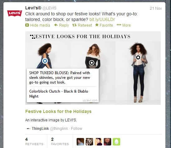
Experiment with ways to marry products and images. Merchants should seek to meld shopping with visual experiences at every turn. We’ve already touched on the emerging phenomenon of shoppable video, which enables shoppers to browse and select products as they’re featured in video content, but solutions also exist for still images, whether it’s an interactive look book that seamlessly marries a visual narrative with the opportunity to select and buy featured items, or individual images with embedded product information that can be displayed across touchpoints, such as when Levi’s used ThingLink during the 2012 holiday season to create links to product information. Brand followers on social networks could mouse over the image and view product links in a popup window.

Shoppable image from Levi's

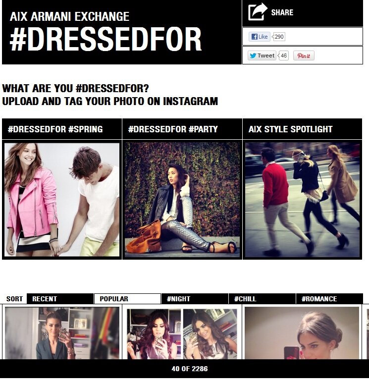
Tap into user-generated image potential. Whether or not merchants establish their own brand outposts on Pinterest or capture images using Instagram, they should find ways to tap the creative impulses of their brand followers. Prize contests or community recognition can provide the incentive to participate. The Armani Exchange Dressedfor.com site displays fashion photos uploaded to Instagram by brand followers, with contributions occasionally called out on the brand’s Twitter feed.

Social imagery example from Armani Exchange

Use images to bring online offline. Merchants should seek new ways to draw consumers everywhere into the online experience, whether through QR codes in store displays or via product tie-ins on television shows. During New York Fashion Week early last year, L’Oreal offered free rides in taxis emblazoned with product images and scannable codes so that passengers could shop with their mobile phones en route to their destinations. The campaign reached fashion-obsessed consumers in a location conducive to shopping — what else is there to do in a cab stuck in traffic? One in three riders snapped a product image, according to SpyderLynk, which furnished the scannable tags.

Offline online imagery connection example from L'Oreal

How are you using images and video to enrich the shopping experience?

Webinar recap: boosting loyalty through post-purchase messaging

As we discussed in a recent post, boosting customer loyalty should be a top priority for merchants as the eCommerce market matures. One crucial stage in fostering that loyalty is the post-purchase period, when interactions with the brand can either convert customers into brand advocates and spur additional purchases — or sour the relationship irreparably. Unfortunately, too many merchants still don’t take full advantage of this ripe opportunity: for example, less than half include additional product or service offers in transactional emails,  according to Jim Davidson of Bronto Software, whose webinar last week revealed focused on how to engage customers during the post-purchase period.

In a guest post last week, Davidson introduced the concept of the “near customer” when it came to pre-purchase interactions — and during the webinar, he extended that idea to the immediate post-purchase period, when buyers become “near customers” for that next potential transaction. Citing data from an upcoming Bronto study, Davidson said not only do too few merchants use order confirmation and shipping notification emails to invite further engagement with the brand, but an astonishing 75% don’t customize campaigns to purchasers beyond those initial transactional communications — leaving a vast opportunity untapped.

Among the wealth of information and examples Davidson provided, one theme to emerge was how the content of the transactional messages should change over time to forge the strongest possible connection with customers and encourage re-engagement. Merchants should:

Use initial transactional messaging to instill brand confidence. While merchants may already include explicit invitations to re-engage with the brand — perhaps by signing up for further email updates or connecting via social media — there’s a subtler, but just as important, message that transaction emails can send, which is to reassure shoppers that they’ve purchased with a brand that will follow through and offer stellar support for their products. To help boost customer confidence, merchants should:

  • Match the design, style and tone of transactional emails to the rest of the shopping experience. An awkwardly-automated order confirmation email that contains no connection to the brand can cast doubts for customers and make them wonder if their order will be fulfilled correctly.
  • Restate order details prominently. Reassure shoppers that the right product will be shipped to them in a timely manner with not only the product name, but a SKU-specific image — a tactic used by just 40% of merchants, Davidson said. Include any was/is pricing or discounts to remind shoppers how much they saved with the transaction.
  • Display an estimated delivery date to proactively address shoppers’ chief concern. Even before the shipping confirmation message, remind shoppers of the delivery timeframe for their order to arrive.
  • Begin customer service messaging immediately. Proactively promote customer service contact details such as an 800 number or email along with hours of service, and message crucial order information such as how to handle changes, cancellations and returns. Although including information on returns may feel too preliminary considering the order hasn’t even been received yet, Davidson noted that customers may use the message as a resource for getting in touch once they’ve received their items. Additionally, such messaging reinforces the commitment the brand has made to stand behind the products on offer and to deliver stellar service.

eBags offers a bevy of customer service information in its order confirmation email, from the order number and date positioned prominently at the top to no fewer than five sections lower in the message devoted to shipping and delivery, gift services, and other customer service information.

transactional messaging example from eBags

Fine-tune timing of post-delivery messages. Davidson offered an array of ideas for further post-purchase communications beyond order confirmation and delivery details, from offering tips and tricks for using products to discount coupons for future purchases. These messages should be timed according to the merchant’s product cycles and replenishment timelines, but in general, merchants should:

  • Trigger review invitations later. Merchants who invite customers to contribute product reviews should key the emails off the delivery date, not the order date — and should factor in enough time to allow shoppers to get to know the product, Davidson counseled. In addition, giving customers more time before prompting a contribution can help focus reviews on the product itself, rather than on any glitches encountered during order fulfillment.
  • Prompt replenishment orders earlier. By contrast, merchants selling replenishment items such as beauty products or food can pre-empt the next research and buying process by prompting customers to set up a recurring order shortly after the initial purchase. Assuming they’ve had a positive experience of the brand thus far, buyers may opt for the convenience of establishing a re-order schedule rather than repeatedly investing time into seeking out the products again. Specialty music merchant Sharmusic.com crafted emails reminding buyers to replace their instrument strings every six months, and offering a quick reorder link. For those customers who might opt to try something new, the emails also included an invitation to connect with customer service for expert help, and offered free shipping above a threshold to incentivize repeat purchasing. The messages drove conversion 21% higher than other emails, according to Davidson.

Post-purchase email example from Sharmusic.com

  • Identify and target lapsed buyers. While the definition of a lapsed buyer varies according to the product offering and the brand, messaging to this segment of the customer base is a worthwhile endeavor for everyone: Davidson said emails prompting re-engagement and re-purchase typically produced conversion rates three times higher and average order value two times higher than typical campaigns. Davidson noted, however, that merchants need to take into account orders across touchpoints when targeting lapsed buyer messaging; sending a “We’ve Missed You” email to a shopper who hasn’t made repeat purchases online, but buys frequently in a physical store location, exposes a disjointed approach that can reduce rather than boost customer confidence in the brand. And any invitation to reconnect should make it easy to do so across channels, such as this email from West Elm offering a 15% discount that can be claimed online or by printing the email so the bar code at the bottom can be scanned at the point of sale in stores.

Post-purchase email example from West Elm

How are you using transactional email to keep customers engaged — and buying?

WordPress SEO fine-tune by Meta SEO Pack from Poradnik Webmastera