From engagement to purchase: just-right checkout
June 18, 2013 Leave a Comment
One of the frequent questions merchants face is how to optimize the checkout process on the eCommerce site. The issue is a crucial one: not only does streamlined checkout help combat cart abandonment, but with the proliferation of alternative payments and gifting options, it’s vital to create a smooth process that can adapt to shoppers’ preferences.
Single-page formats have debuted in recent years, due to the perception that a single page presents fewer hurdles for shoppers and is easier to understand and digest. Case studies have shown that single-page checkout can boost completion more than 20%.
But as with anything, the devil is in the details. Like multi-page checkout, single-page checkouts can be streamlined or cluttered, straightforward or confusing, and can lead to gratification or frustration. Because single-page checkouts require more complicated technical processes to verify the information shoppers submit as they proceed down the page, they can be harder to execute, especially when all those options for alternative payment, multiple delivery addresses and the like are factored in.
Perhaps that’s why, in a sampling from the top 100 merchants in Internet Retailer’s Top 500 list, the vast majority — nearly 89% — use a multi-page checkout, with most sites featuring a process that takes four pages to move from the login page through to “submit order”. (We didn’t count the cart page or the post-order confirmation page, and we simulated the simplest of purchases: one that would be shipped solely to the billing address, without gifting options, and paid with a credit card.)
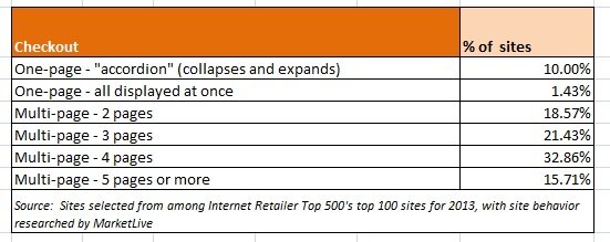
Clearly, one-step checkout isn’t the panacea for every path-to-purchase fallout problem merchants face; otherwise these merchants, who number among the biggest of the big brands, would have adopted it. But the good news is that regardless of the number of steps involved, merchants can deploy tactics that help shoppers along the path to purchase — balancing the desire for simplicity with the need for trust-building signposts. To optimize checkout, merchants should:
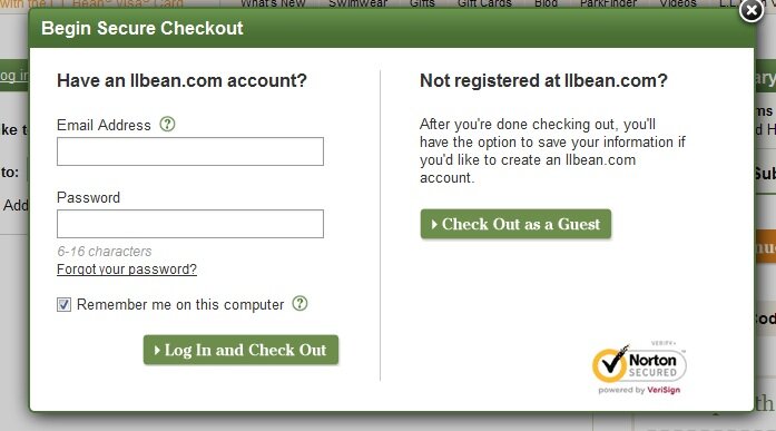
Consider a hybrid model. Merchants needn’t adopt an either/or stance when it comes to checkout; they can blend aspects of one-page and multi-step formats to create the sleekest possible path to purchase. Several merchants we surveyed in the two-page category use the first page to determine if shoppers are existing account holders, new reigstrants, or guest checkout users, and then follow up with a one-page checkout tailored to their preferences — thereby ensuring the single-page format includes only the options appropriate to the audience. L.L. Bean uses a modal window to determine whether shoppers are current account holders, then presents a clearly-labeled accordion-style single-page checkout. Guest users are invited to create an account as part of the process.
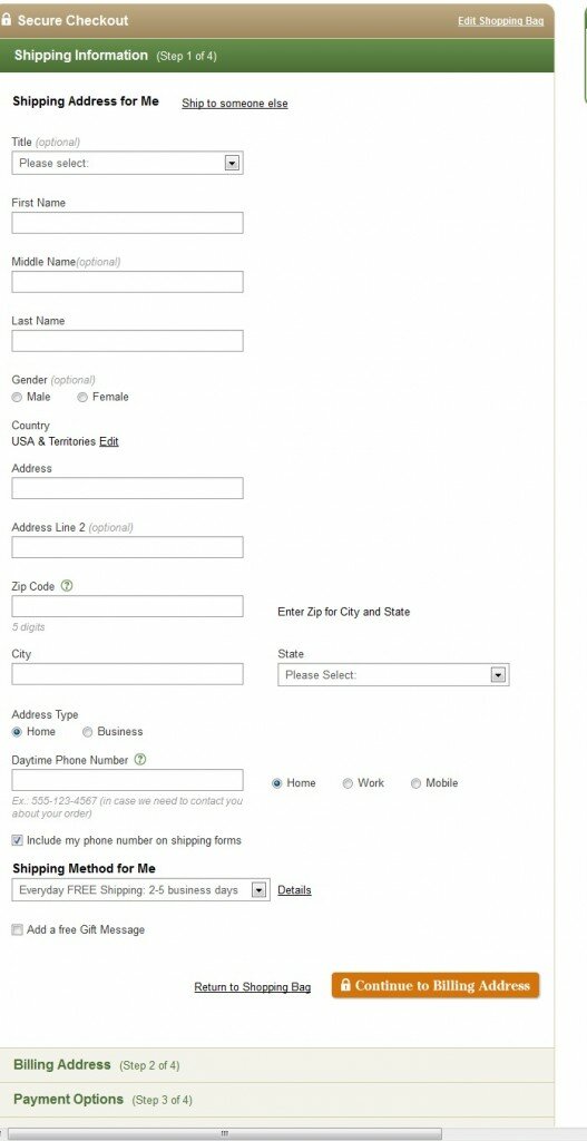
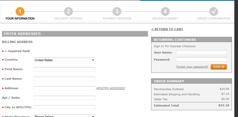
Downplay less-popular options. Merchants should use their analytics to determine which checkout options are used infrequently, and then position them accordingly on the page. For example, merchants already routinely use a checkbox to let shoppers duplicate their shipping address information into the billing address form; some merchants we surveyed took this notion a step further, eliminating the form for entry of the second address altogether unless shoppers indicated the need for it. Similarly, the option to log in as a registered account holder was placed in the right-hand column on a number of merchant sites we surveyed, thereby eliminating the need for a “login or guest checkout” starter page altogether. Dick’s Sporting Goods uses this technique, labeling the registered-user process “express checkout” to flag to shoppers the expediency of creating an account.
Provide access to live help. Regardless of the number of steps in checkout, merchants should make access to customer service easy and prominent. Live chat prompts are appropriate throughout, with proactive invitations triggered if shoppers “stall” at any point in the process. And other means of reaching customer service should be prominently signposted, as on the Bass Pro Shops eCommerce site, where a specialized header highlighting customer service and providing links to product guarantees and FAQs is used throughout checkout.

Truly integrate alternative payments. As we’ve previously written, offering alternative payments is now commonplace. But merchants shouldn’t merely divert shoppers into alternative payment processes right from the cart page; rather, they should incorporate options as much as possible into the checkout process — not only reducing the impact of the jarring experience for shoppers of being handed off to another site, but also enabling collection of key shopper data within the merchant’s native eCommerce platform. Build.com uses a tabbed approach to enable payment with Google Checkout or Paypal — but uses its own eCommerce site to collect shipping information and the shopper’s email address. The third-party payment processes have been tailored to avoid duplicate entry of information, and shoppers return to Build.com for the final order confirmation and placement.
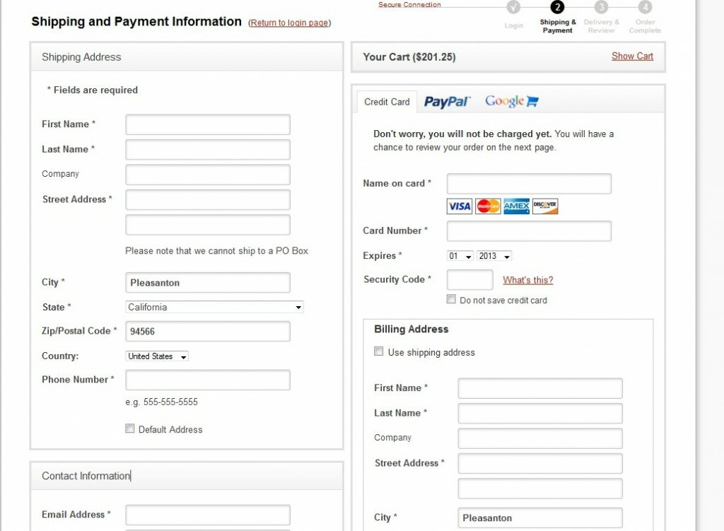
Stay tuned for more optimization strategies as we head toward the all-important fourth quarter. How many steps are in your checkout process, and why?
Connect with us: